Introduction to Altair
MIDS W209: Information Visualization
Andy Reagan | andy[at]andyreagan.com | @andyreagan
https://john-guerra.github.io/MIDS_W209_Information_Visualization_Slides/01_Introduction/altair.html
https://john-guerra.github.io/MIDS_W209_Information_Visualization_Slides/01_Introduction/altair.html

Partially based on slides from Jake VanderPlas
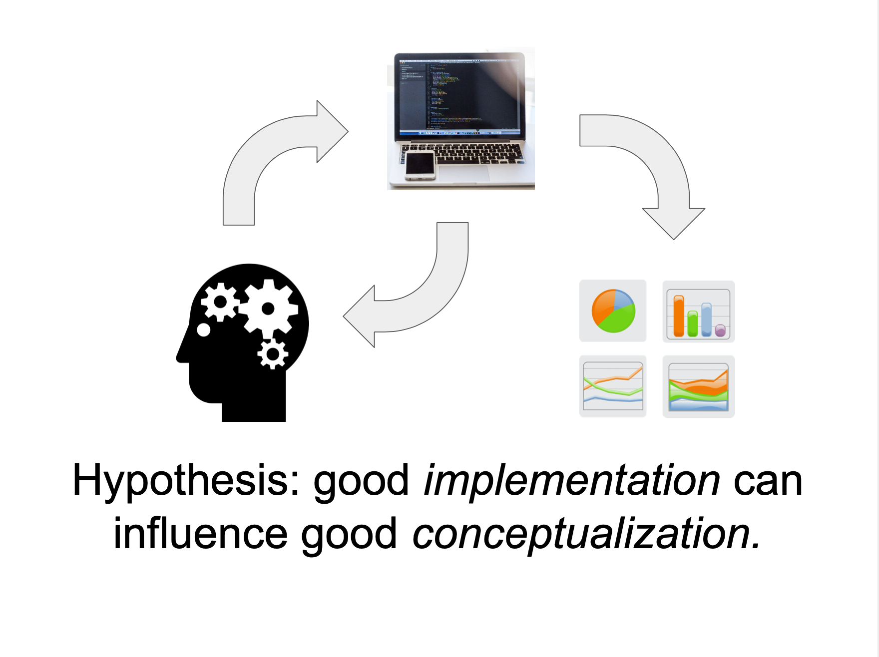
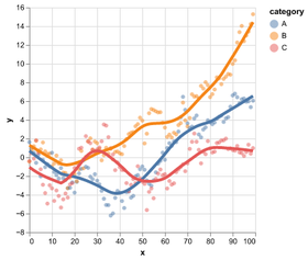
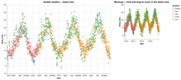
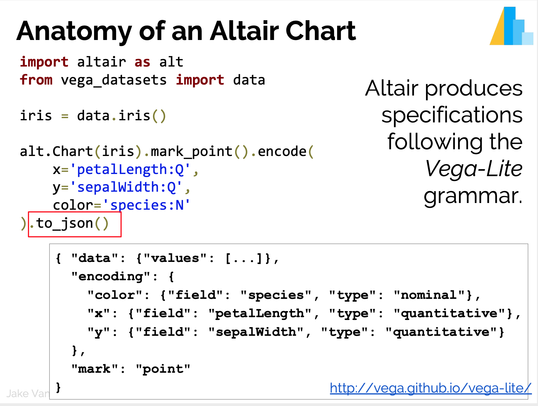
Core idea
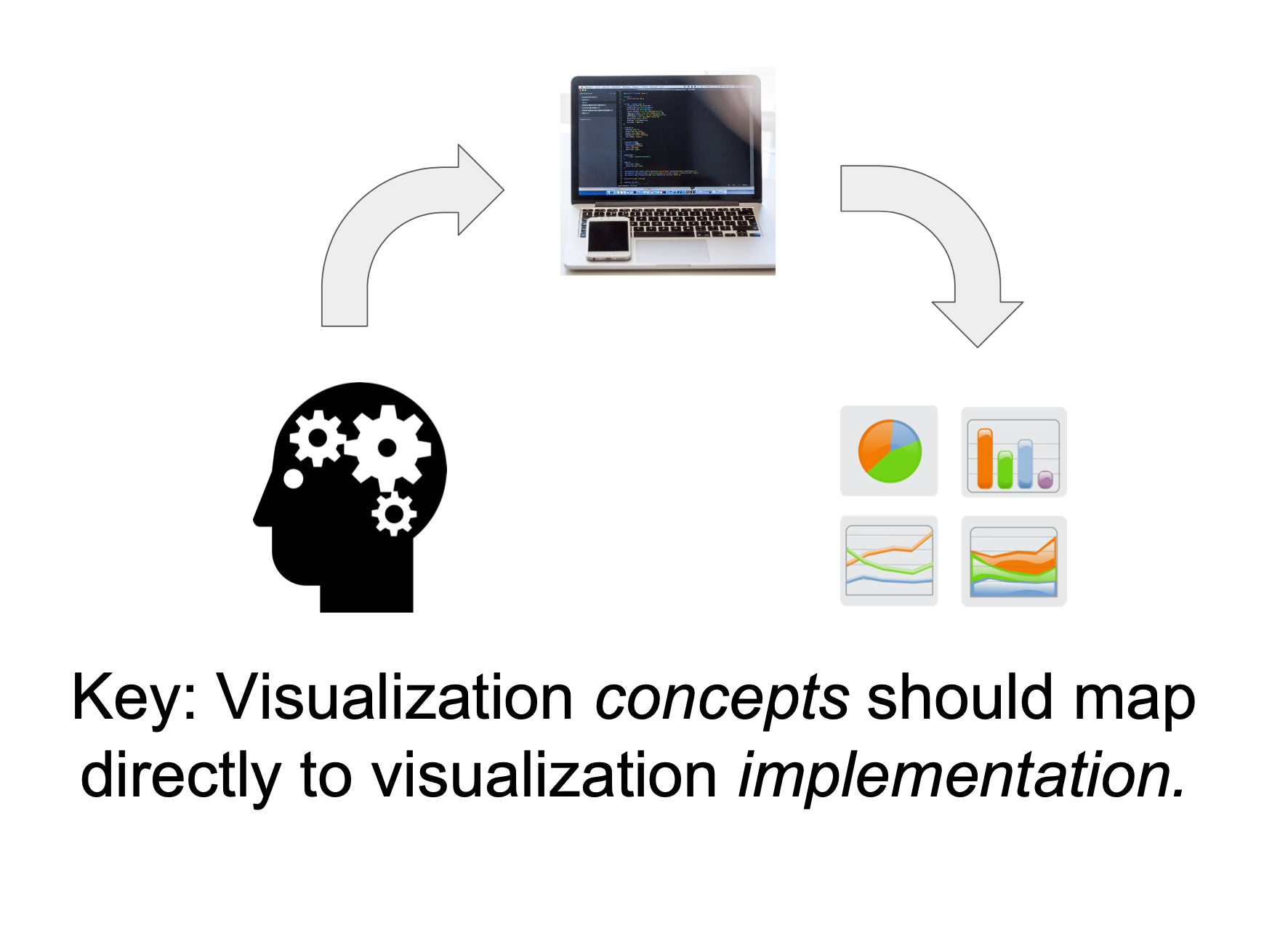
Familiar tool:
Plotting with matplotlib
import matplotlib.pyplot as plt
import numpy as np

x = np.random.randn(1000)
y = np.random.randn(1000)
color = np.arange(1000)

plt.scatter(x, y, c=color)
plt.colorbar()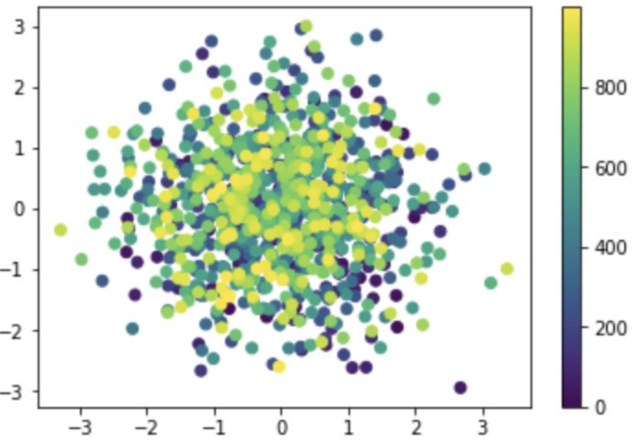
Plotting with matplotlib: strengths
Designed like MatLab: switching was/is easy

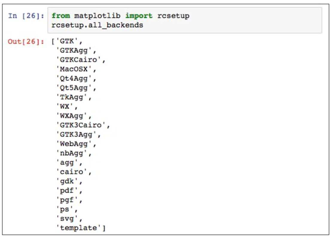
Many rendering backends
Can reproduce just about any plot (with a bit of effort)
Well-tested, standard tool for 15 years
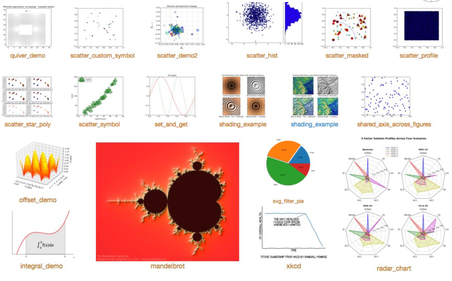
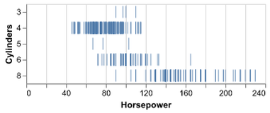
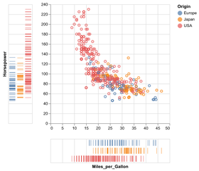
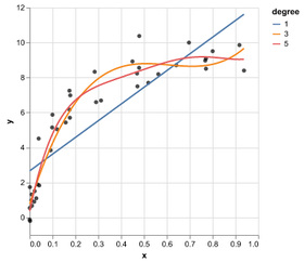
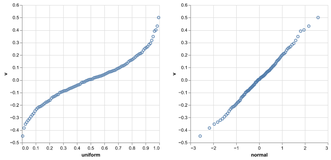
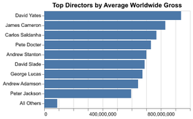
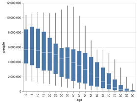
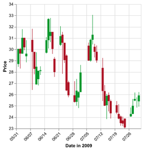
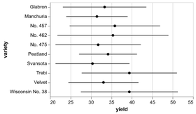
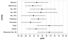
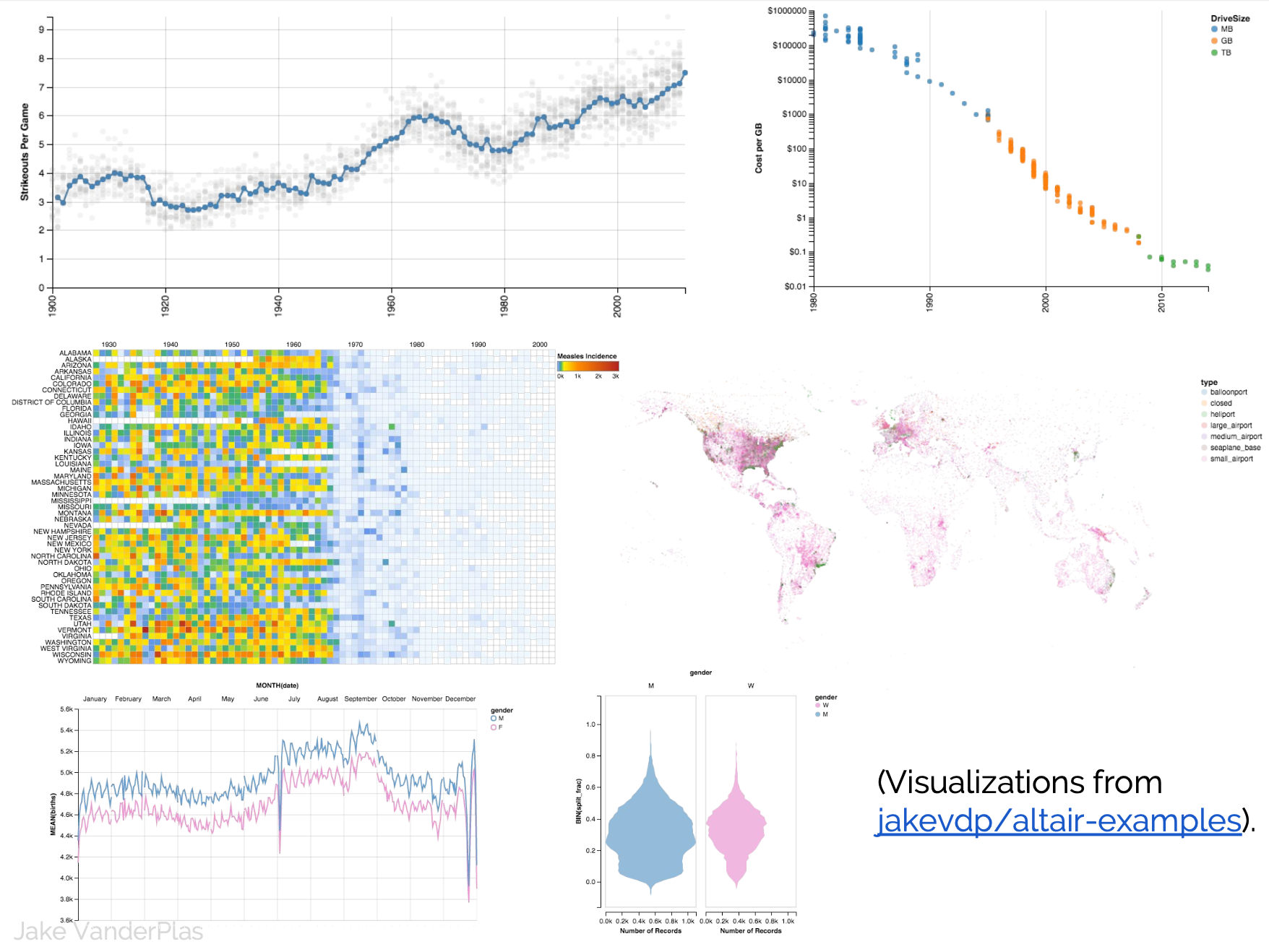
Gallery
Plotting with matplotlib: weaknesses
Designed like MatLab
API is imperative and often overly verbose
Poor/no support for interactive/web graphs
Plotting with matplotlib
import matplotlib.pyplot as plt
import numpy as np
x = np.random.randn(1000)
y = np.random.randn(1000)
color = np.arange(1000)

plt.scatter(x, y, c=color)
plt.colorbar()
Statistical Visualization
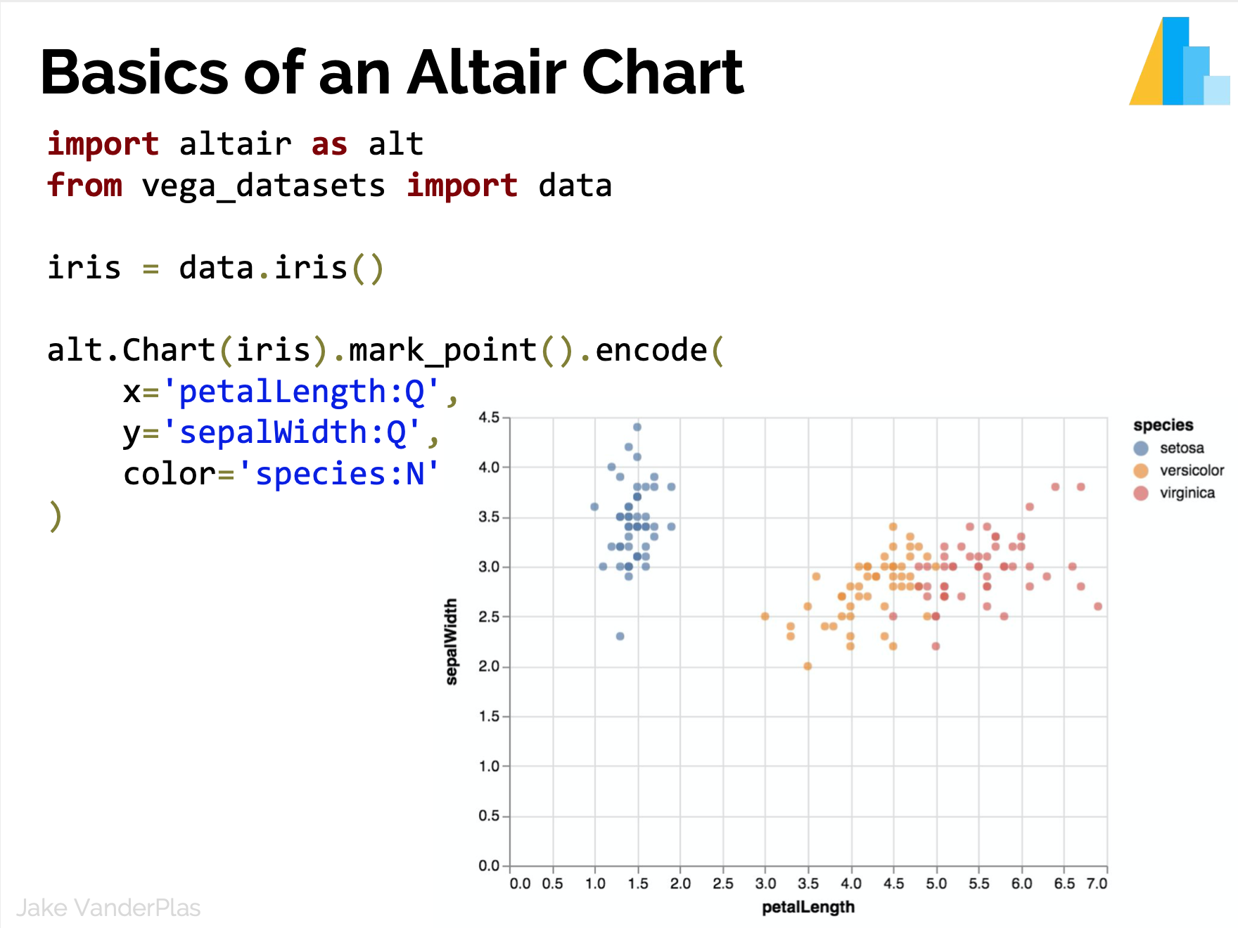
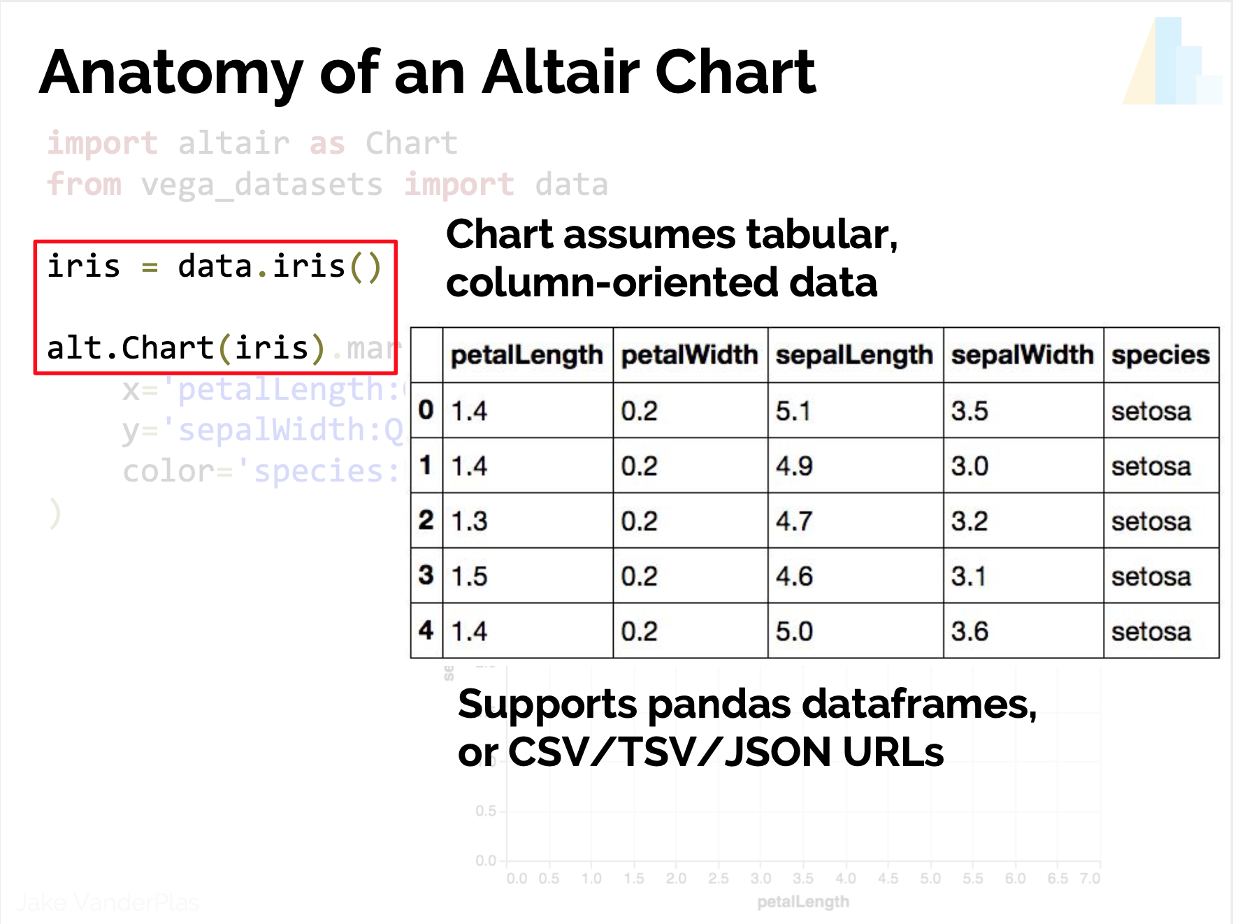
from vega_datsets import data
iris = data('iris')
iris.head()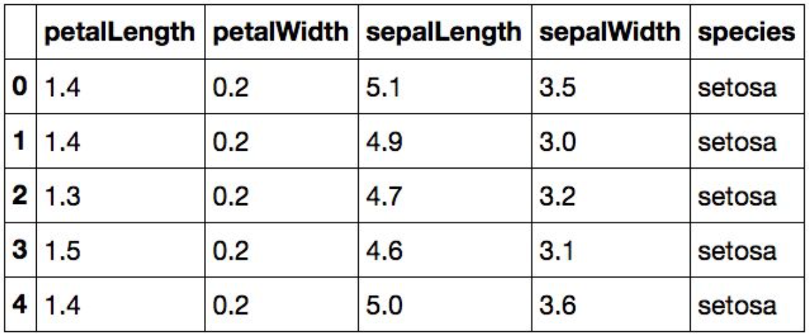
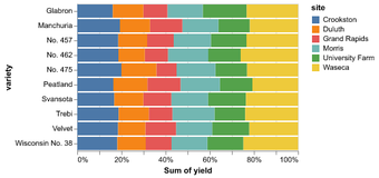
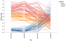
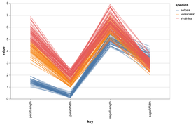
Data in column-oriented format; i.e. rows are samples, columns are features
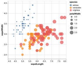
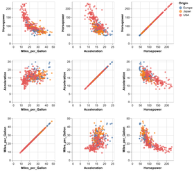
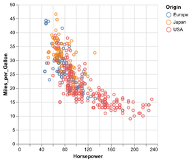
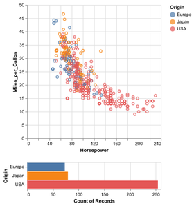
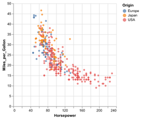
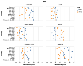
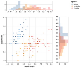
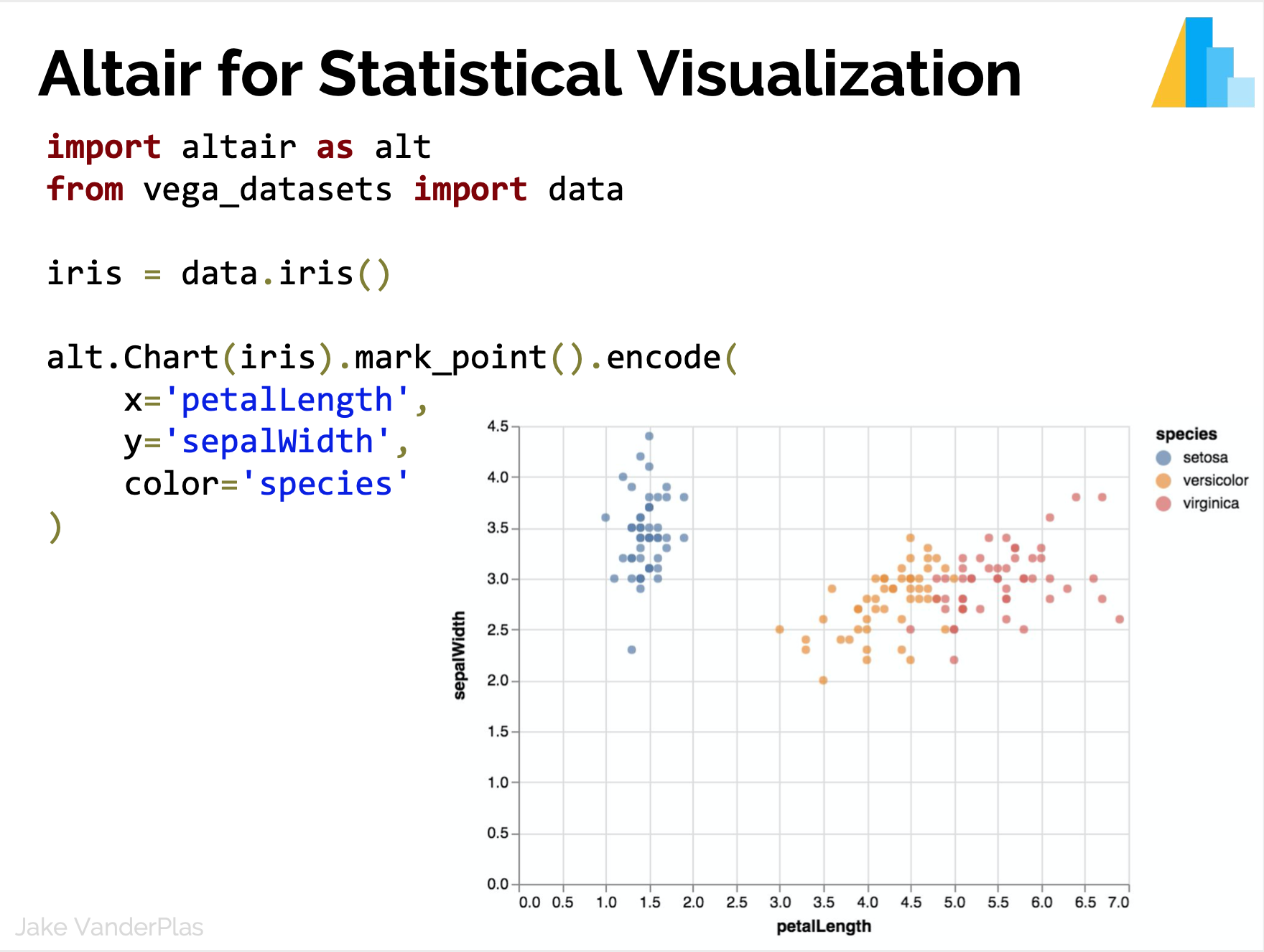
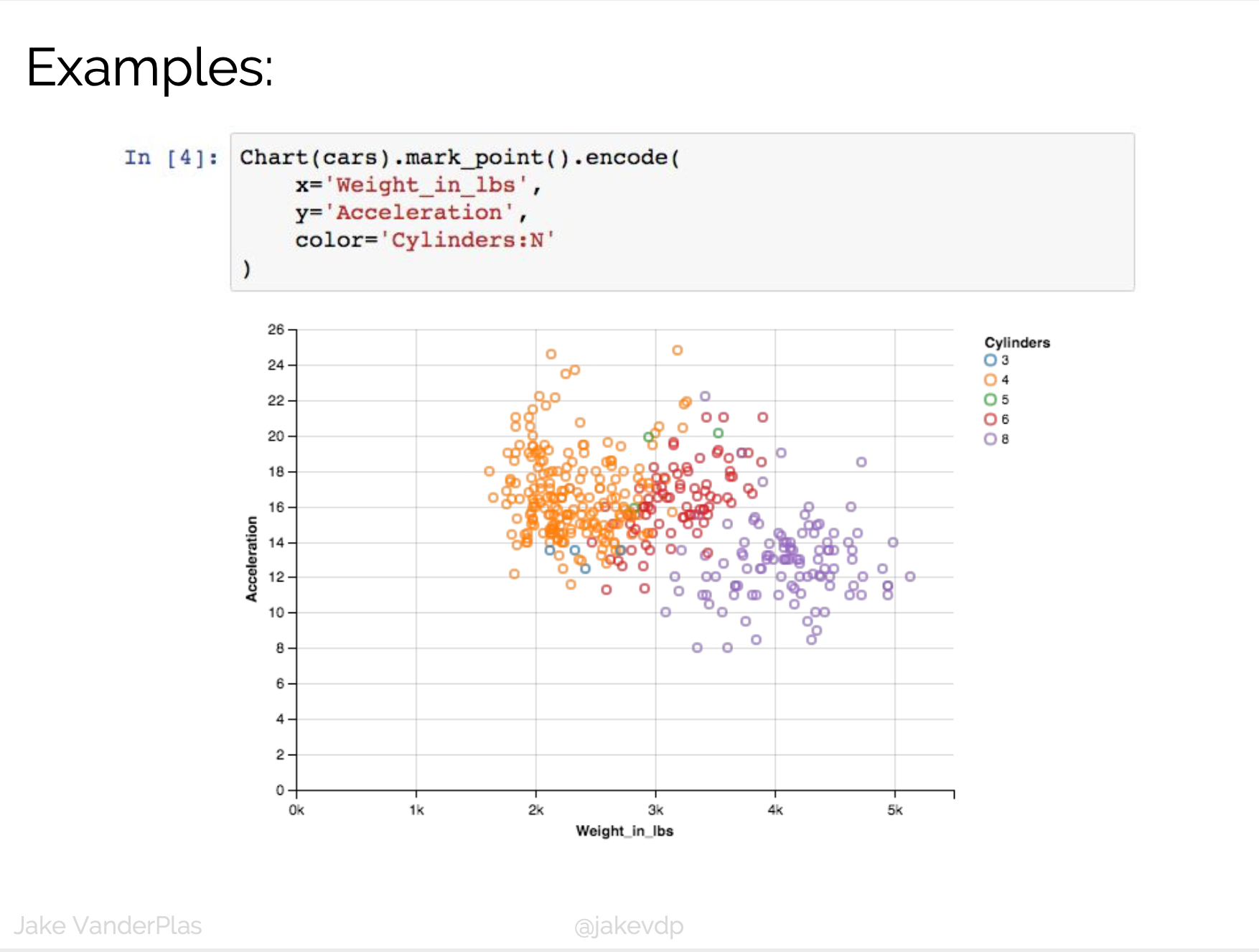
Statistical Visualization: Grouping
color_map = dict(zip(iris.species.unique(),
                     ['blue', 'green', 'red']))

for species, group in iris.groupby('species'):
    plt.scatter(group['petalLength'], group['sepalWidth'],
                color=color_map[species],
                alpha=0.3, edgecolor=None, label=species)

plt.legend(frameon=True, title='species')
plt.xlabel('petalLength')
plt.ylabel('sepalLength')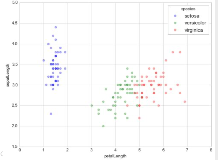
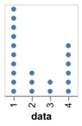
- Data?
- Transformation?
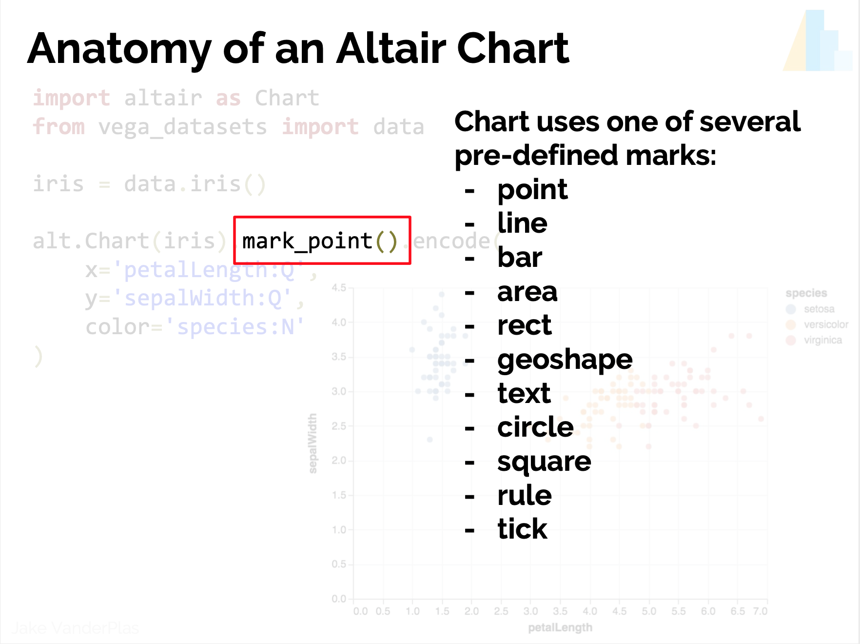
- Marks?
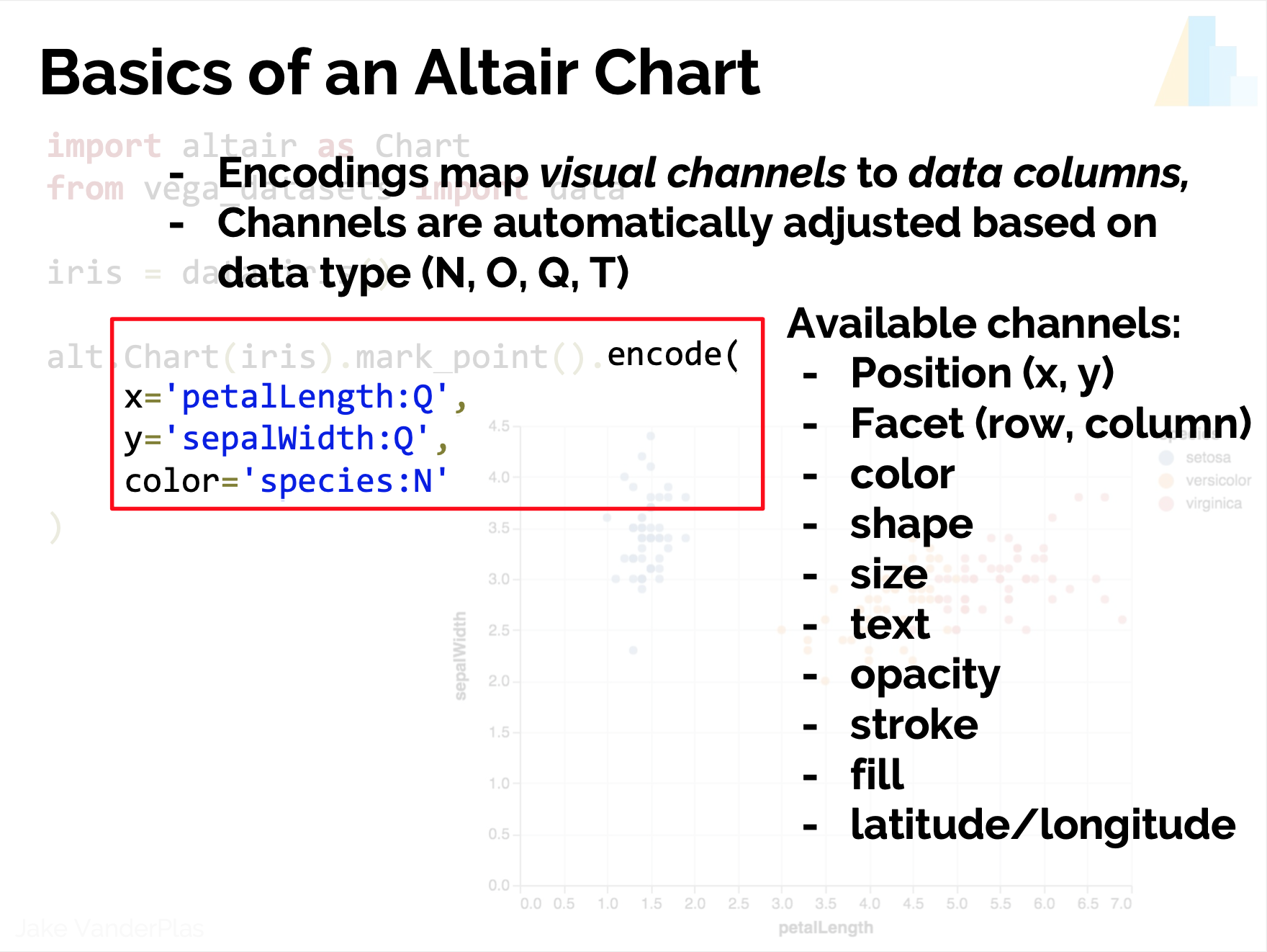
- Encoding?
- Scale?
- Guides?
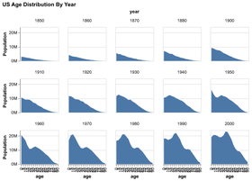
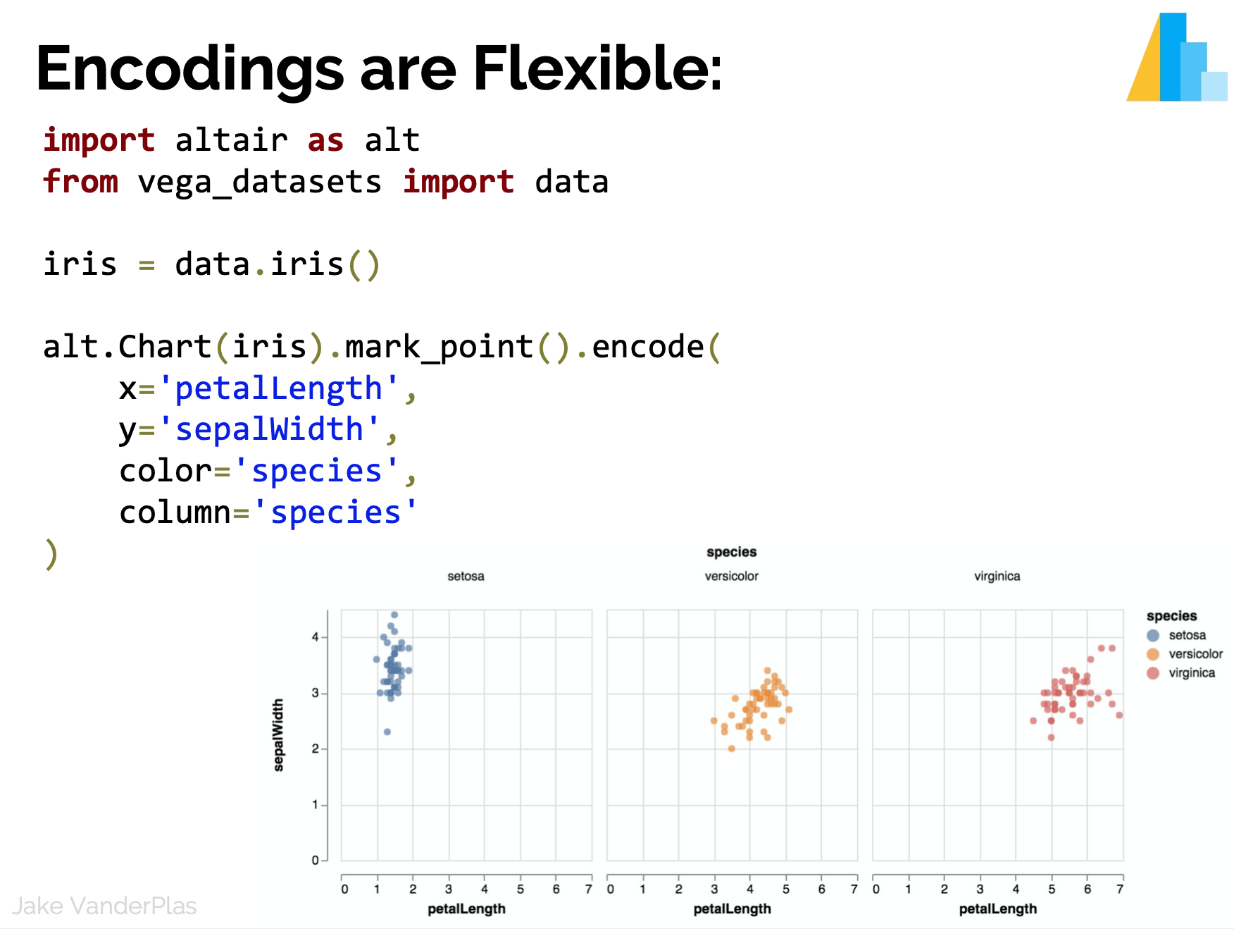
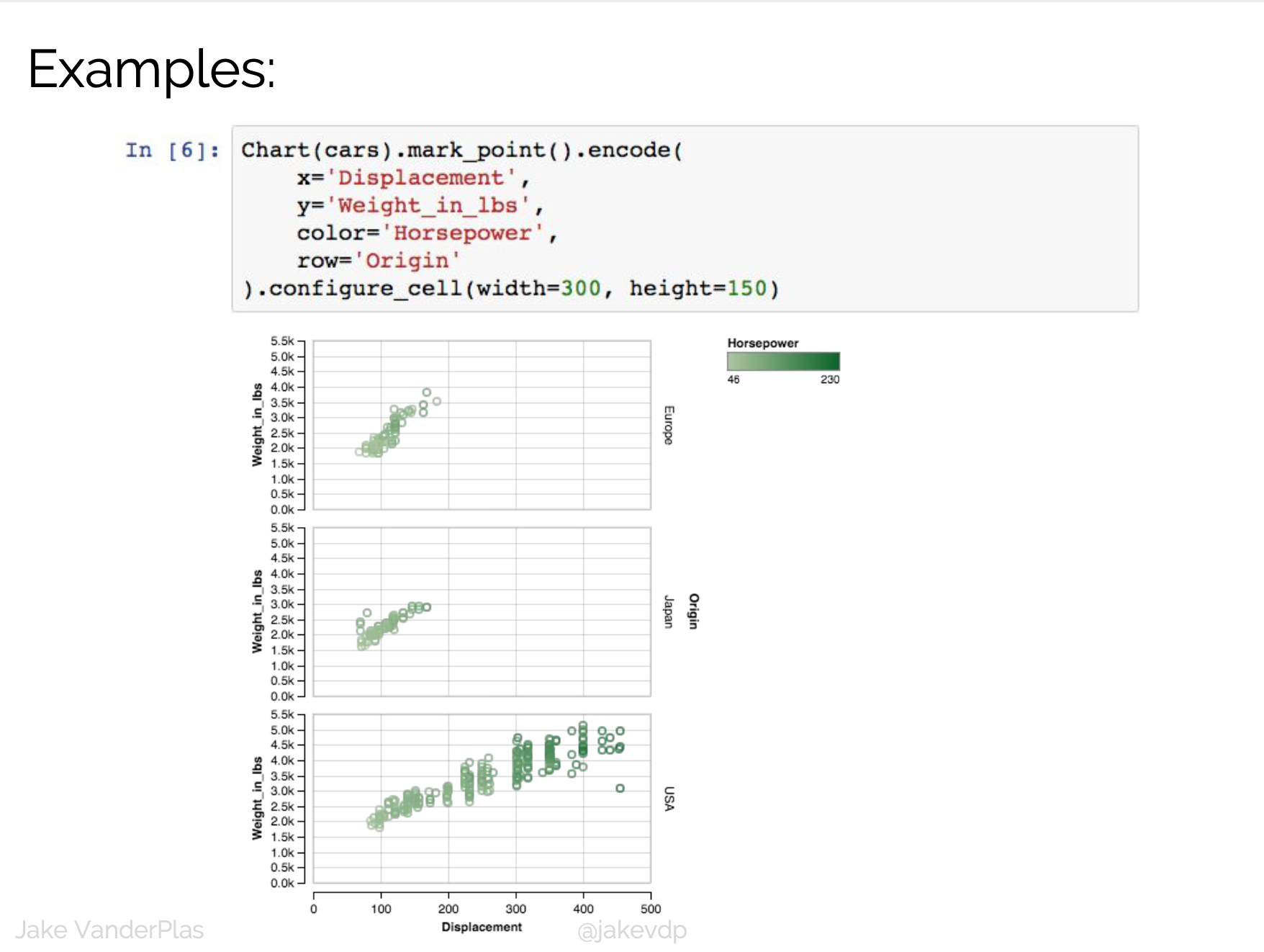
Statistical Visualization: Faceting
color_map = dict(zip(iris.species.unique(),
                     ['blue', 'green', 'red']))
n_panels = len(color_map)

fig, ax = plt.subplots(1, n_panels, figsize=(n_panels * 5, 3),
                       sharex=True, sharey=True)

for i, (species, group) in enumerate(iris.groupby('species')):
    ax[i].scatter(group['petalLength'], group['sepalWidth'],
                  color=color_map[species], alpha=0.3,
                  edgecolor=None, label=species)
    ax[i].legend(frameon=True, title='species')

plt.xlabel('petalLength')
plt.ylabel('sepalLength')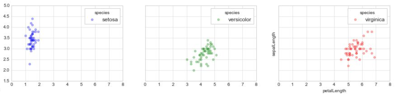
Problem
We’re mixing the what with the how
Toward a well-motivated Declarative Visualization
Imperative
- Specify How something should be done.
- Specification and Execution intertwined.
- “Put a red circle here, and a blue circle here”.
Declarative
- Specify What should be done.
- Separates Specification from Execution.
- “Map
to a position, and to a color".
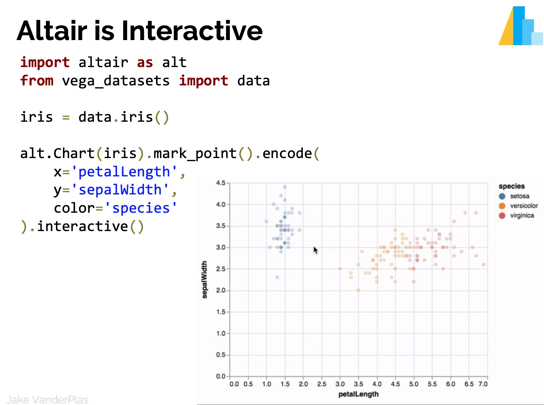
Declarative visualization lets you think about data and relationships, rather than incidental details.
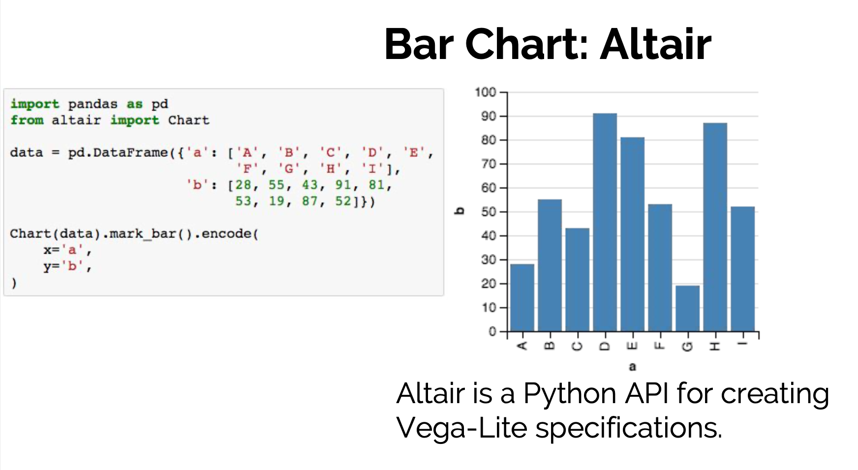
Declarative visualization in Python


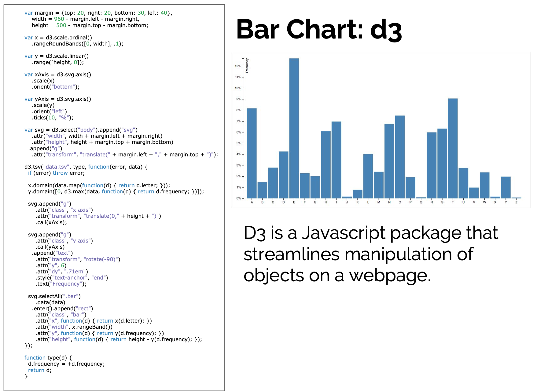
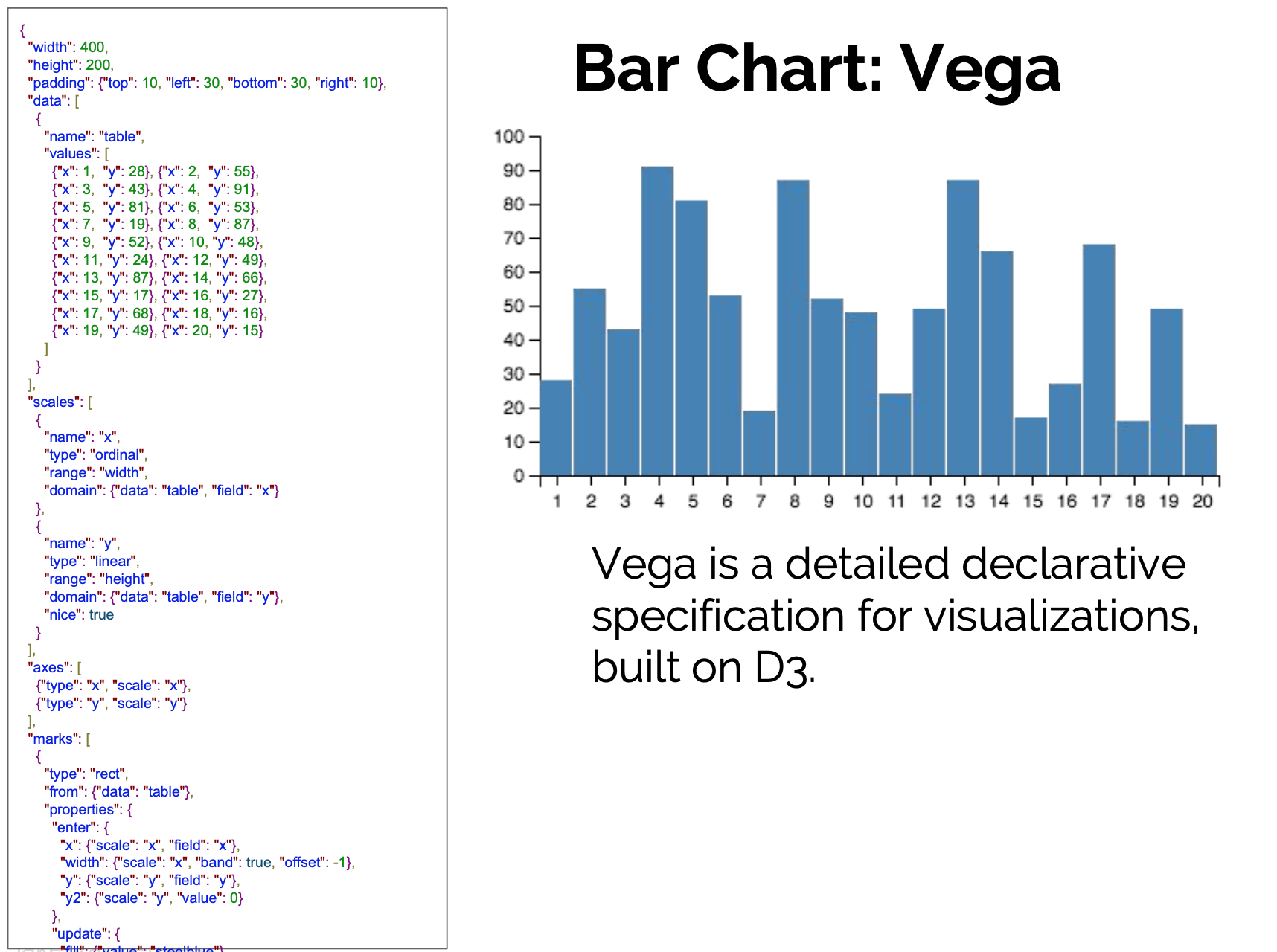
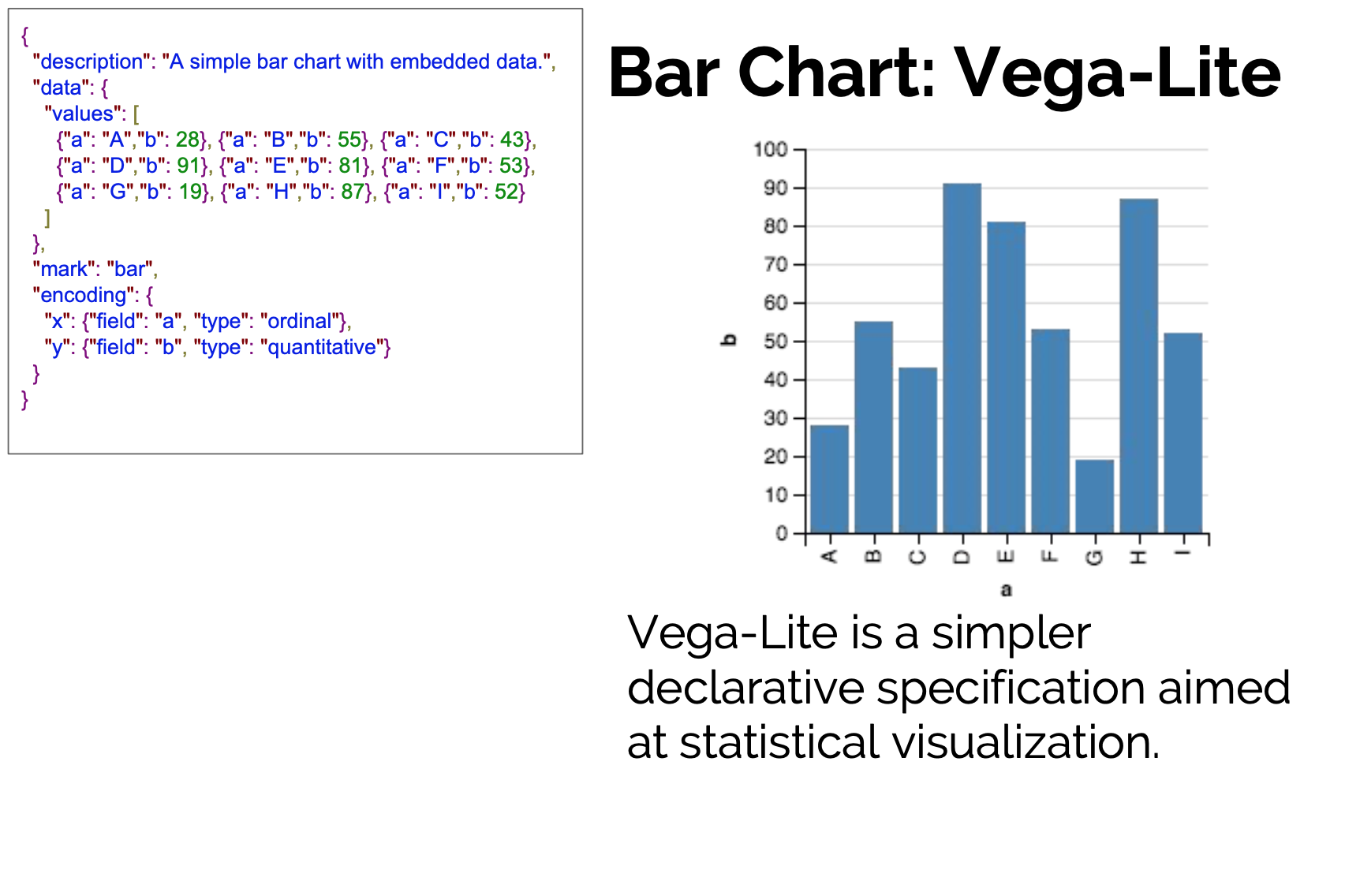
D3 is the go-to vis libary
But working with D3 can be hard