Rules of Thumb
MIDS W209: Information Visualization
John Alexis Guerra Gómez | john.guerra[at]gmail.com | @duto_guerra
https://johnguerra.co/lectures/MIDS_W209_Information_Visualization/05_Rules_of_thumb/
https://johnguerra.co/lectures/MIDS_W209_Information_Visualization/05_Rules_of_thumb/

Partially based on slides from Tamara Munzner
What We Are Going to Learn
- No unjustified 3D or 2D
- Readable text
- Eyes beat memory
- Visualization mantra
- Responsiveness is required
- Function first, form next
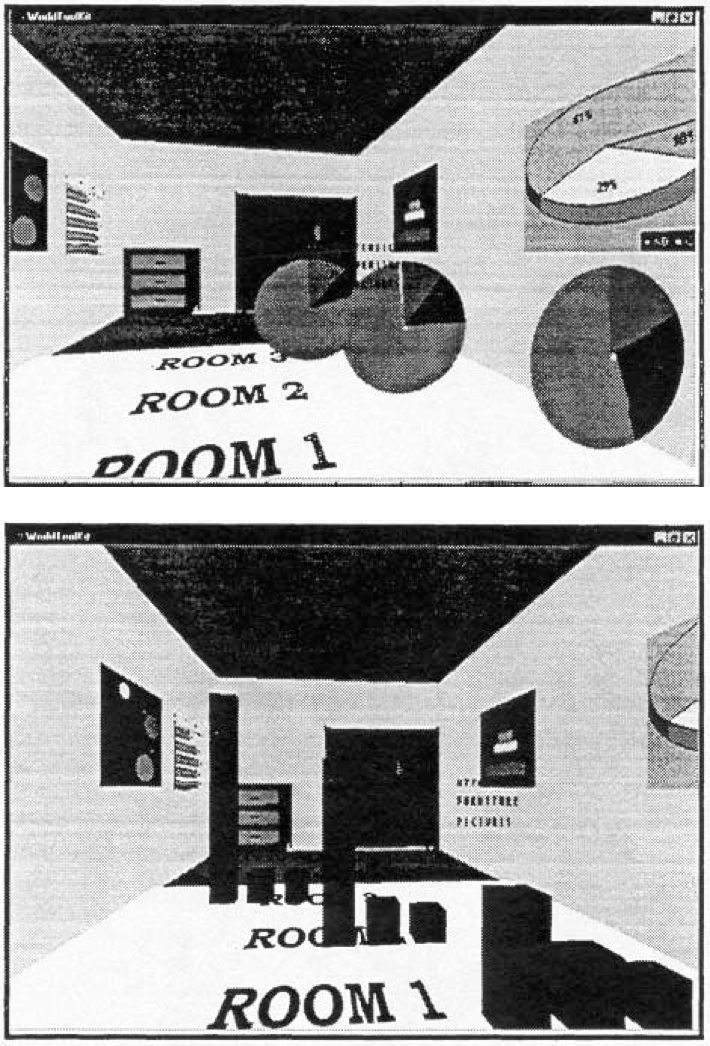
No Unjustified 3D
Unjustified 3D Everywhere

Power of the Plane
Power of the Plane (cont.)
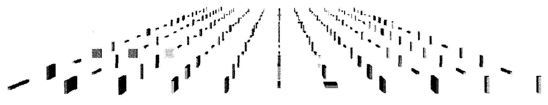
Danger of Depth
We don’t really live in 3D. 👉 We see in 2.05D.
- Acquire more info on image plane quickly from eye movements
- Acquire more info for depth more slowly, from head/body motion
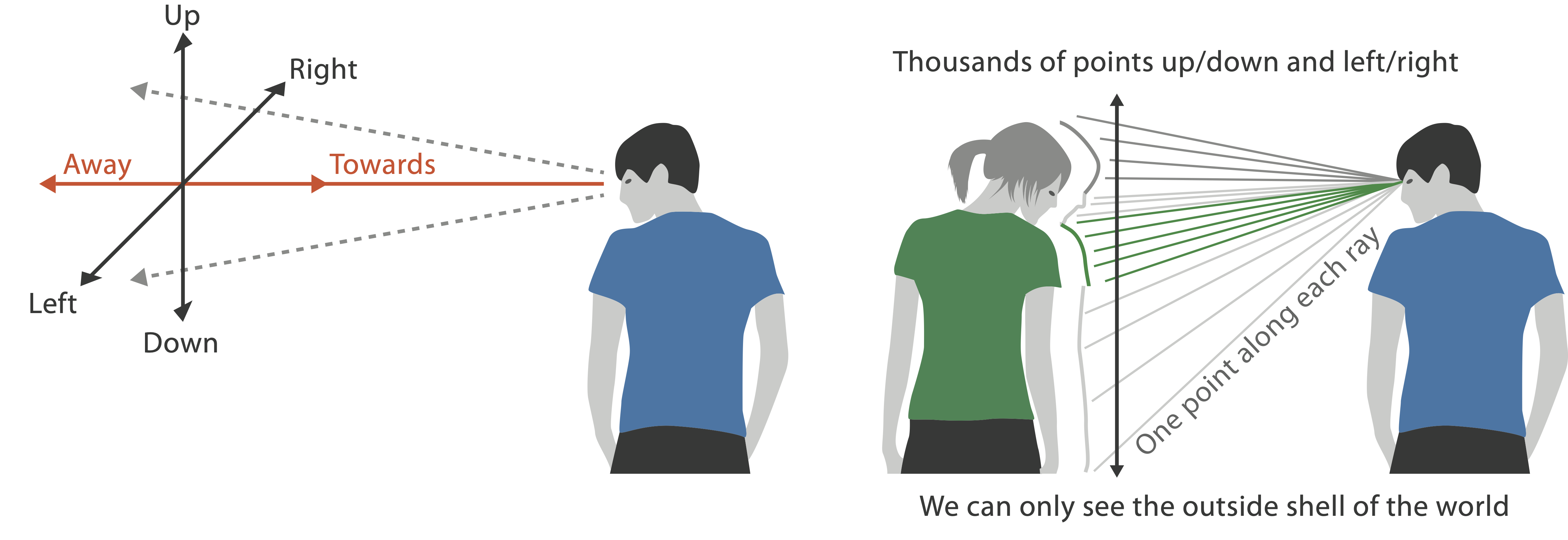
Occlusion Hides Information
- Interaction can resolve occlusion...
- ... but at cost of time and cognitive load
Perspective?
Perspective distortion loses information.
- Interferes with all size channel encodings
- Power of the plane is lost!
Mukherjea, Hirata, and Hara. InfoVis 96]
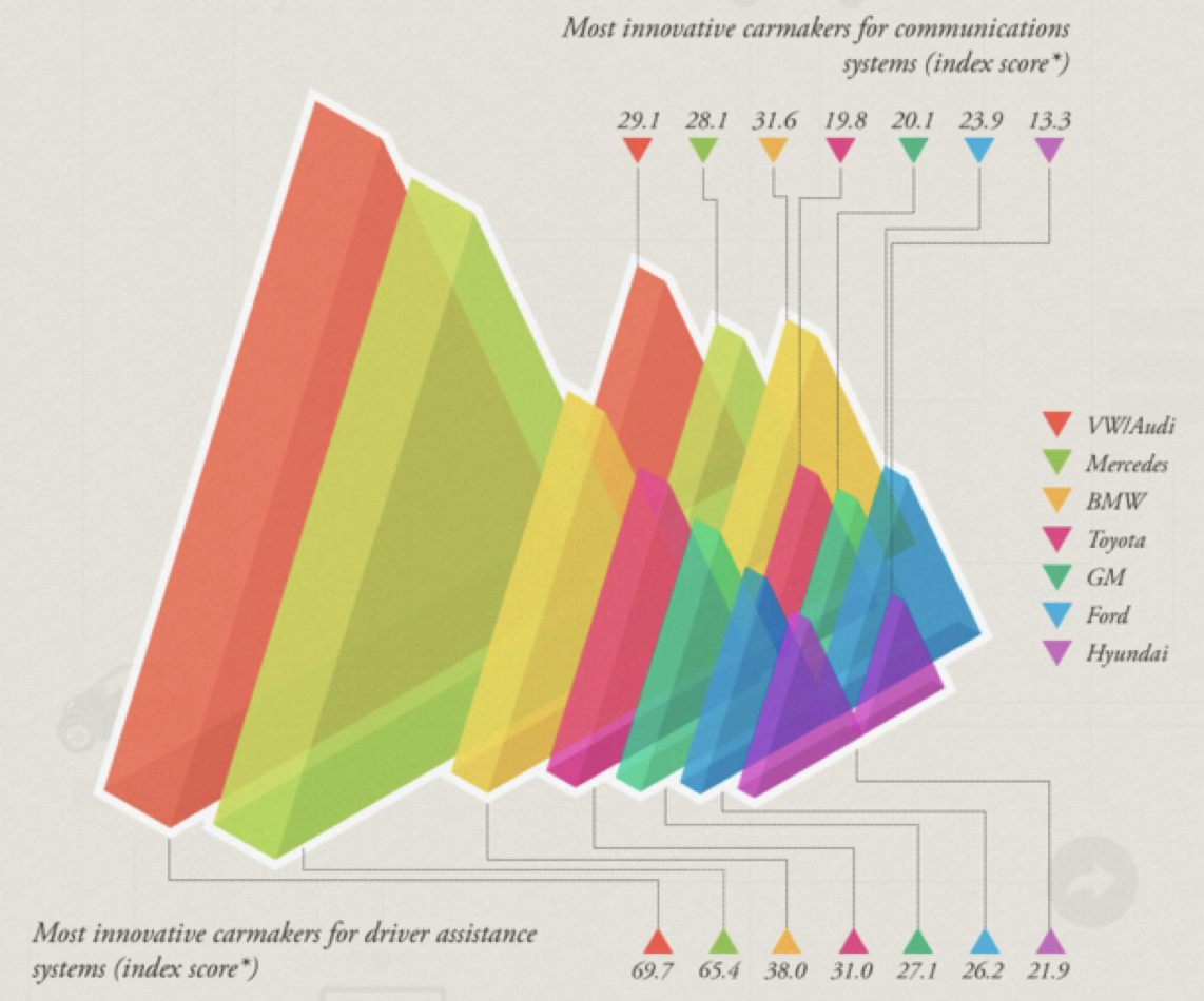
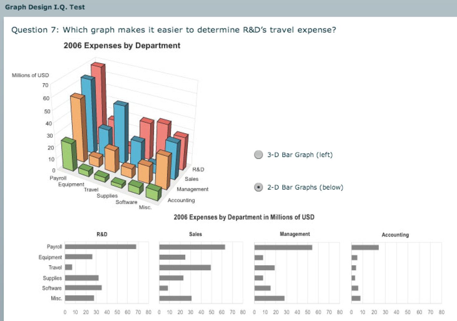
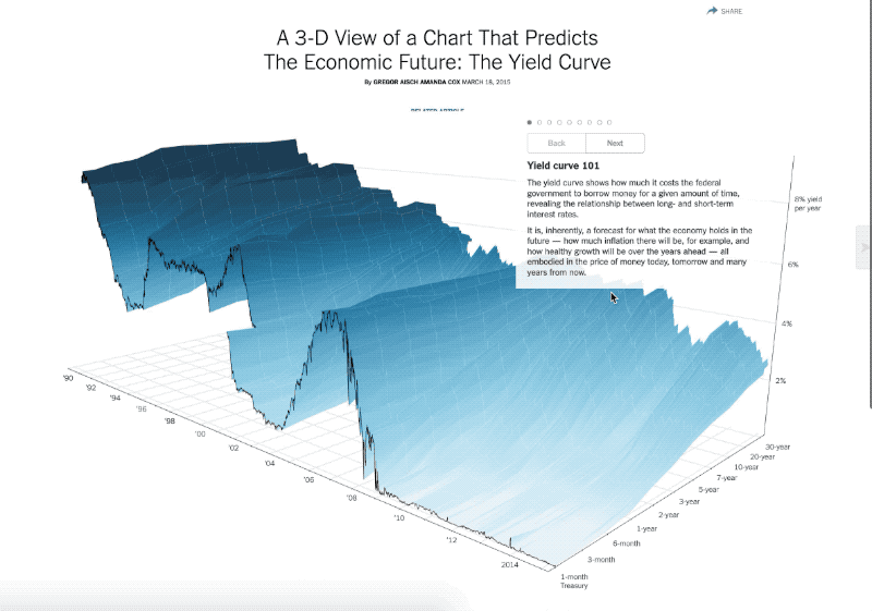
3D vs. 2D Bar Charts
- 🚫
3D bars🚫 - Perspective distortion
- Occlusion
- 2D faceting 👌🏻
Tilted Text Isn’t Legible
- Tilted text 👉 poor legibility
- Further reading:
[Exploring and Reducing the Effects of Orientation on Text Readability in Volumetric Displays. Grossman et al. CHI 2007]
Power Demand of a Research Facility
Task: identify/compare similar periods of time
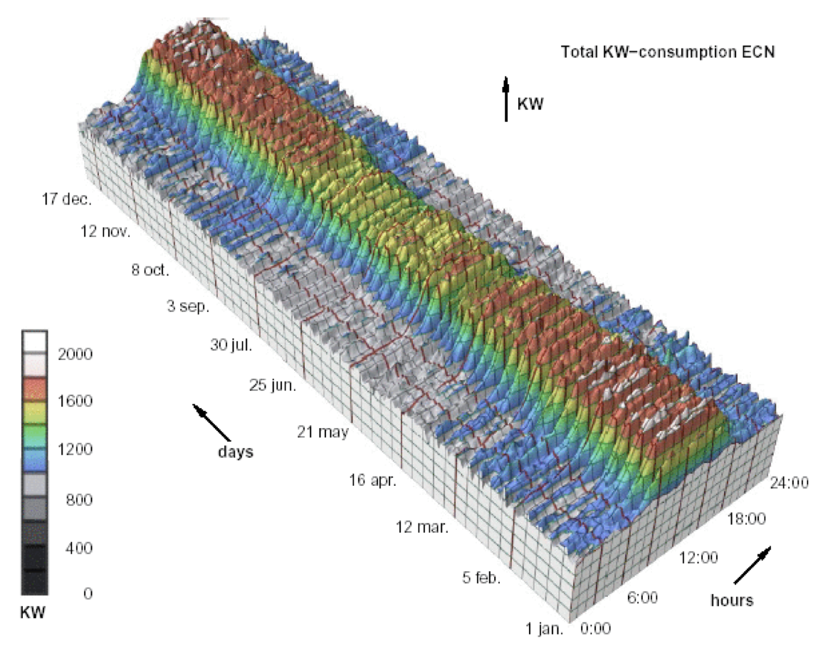
Transform to New Data Abstraction
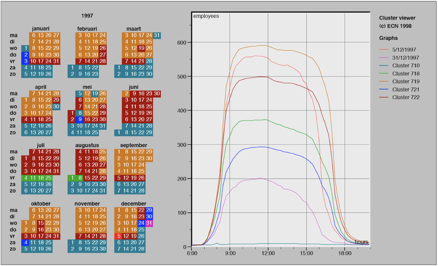
- Derived data: cluster hierarchy
- Juxtapose multiple views (calendar)
- Superimposed 2D curves (clusters)
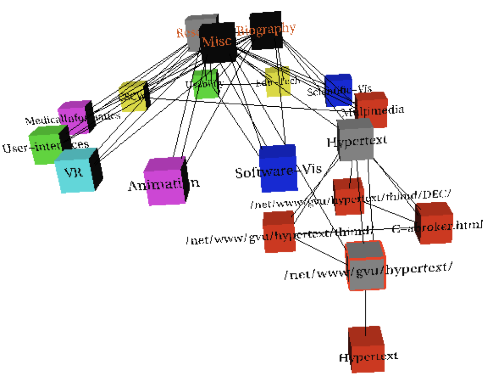
When to Use 3D
Shape perception
- Benefits outweigh costs when target is shape
Good Usage of 3D
Constrained navigation steps
through carefully designed viewpoints
through carefully designed viewpoints
When to Use 3D
- Use 3D for true 3D spatial data. 👍
- 3D needs very careful justification for abstract data.
- Enthusiasm in 1990s, but now skepticism
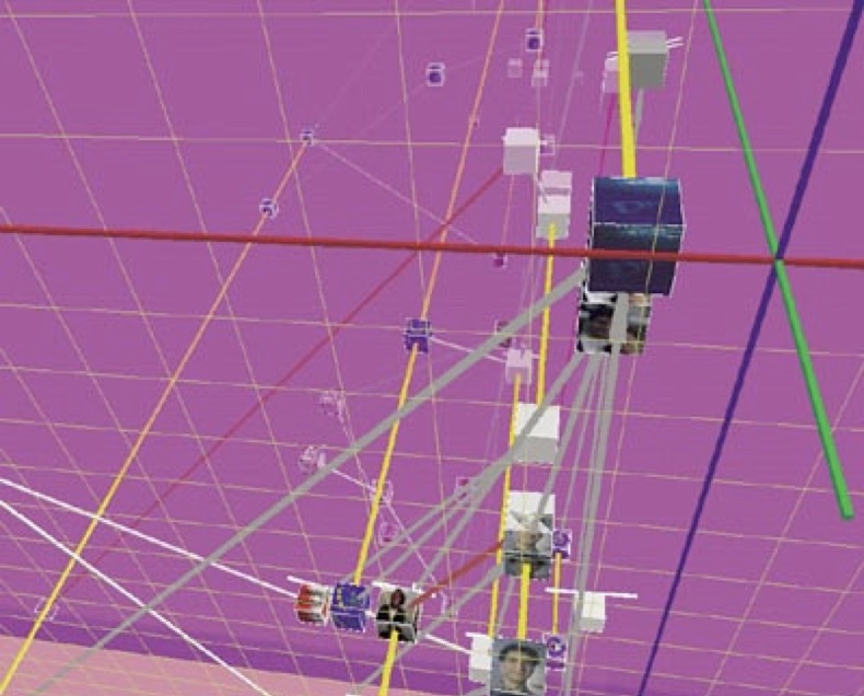
- Be especially careful with 3D for point clouds or networks
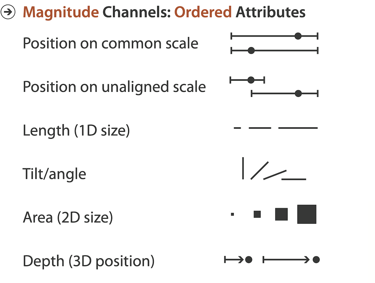
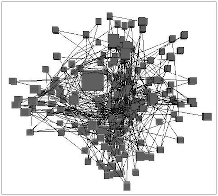
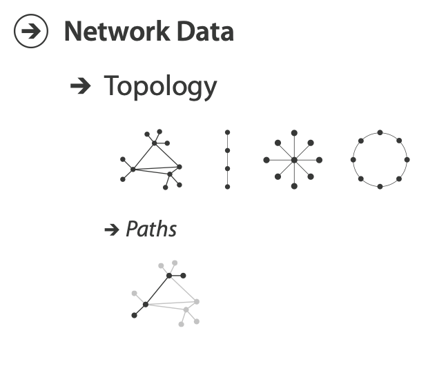
No Unjustified 2D
No Unjustified 2D
- Consider whether network data requires 2D spatial layout
- Especially if reading text is central to task!
- Arranging as network means lower information density and harder label lookup compared to text lists
- Benefits outweigh costs when topological structure/context important for task
- Be especially careful for search results, document collections, ontologies
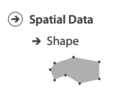
Do You Really Need a Map?
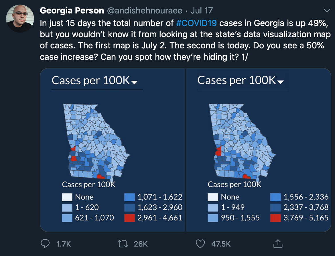
- They use the position location
- Use them for geographical tasks
- Bad for comparison tasks
- Don't use a map just because you have geo data
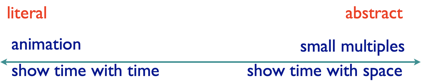
Eyes Beat Memory
Eyes Beat Memory
- Principle: external cognition vs. internal memory
- Easy to compare by moving eyes between side-by-side views
- Harder to compare visible item to memory of what you saw
Eyes Beat Memory (cont.)
- Implications for animation
- Great for choreographed storytelling
- Great for transitions between two states
- Poor for many states with changes everywhere
- Consider small multiples instead
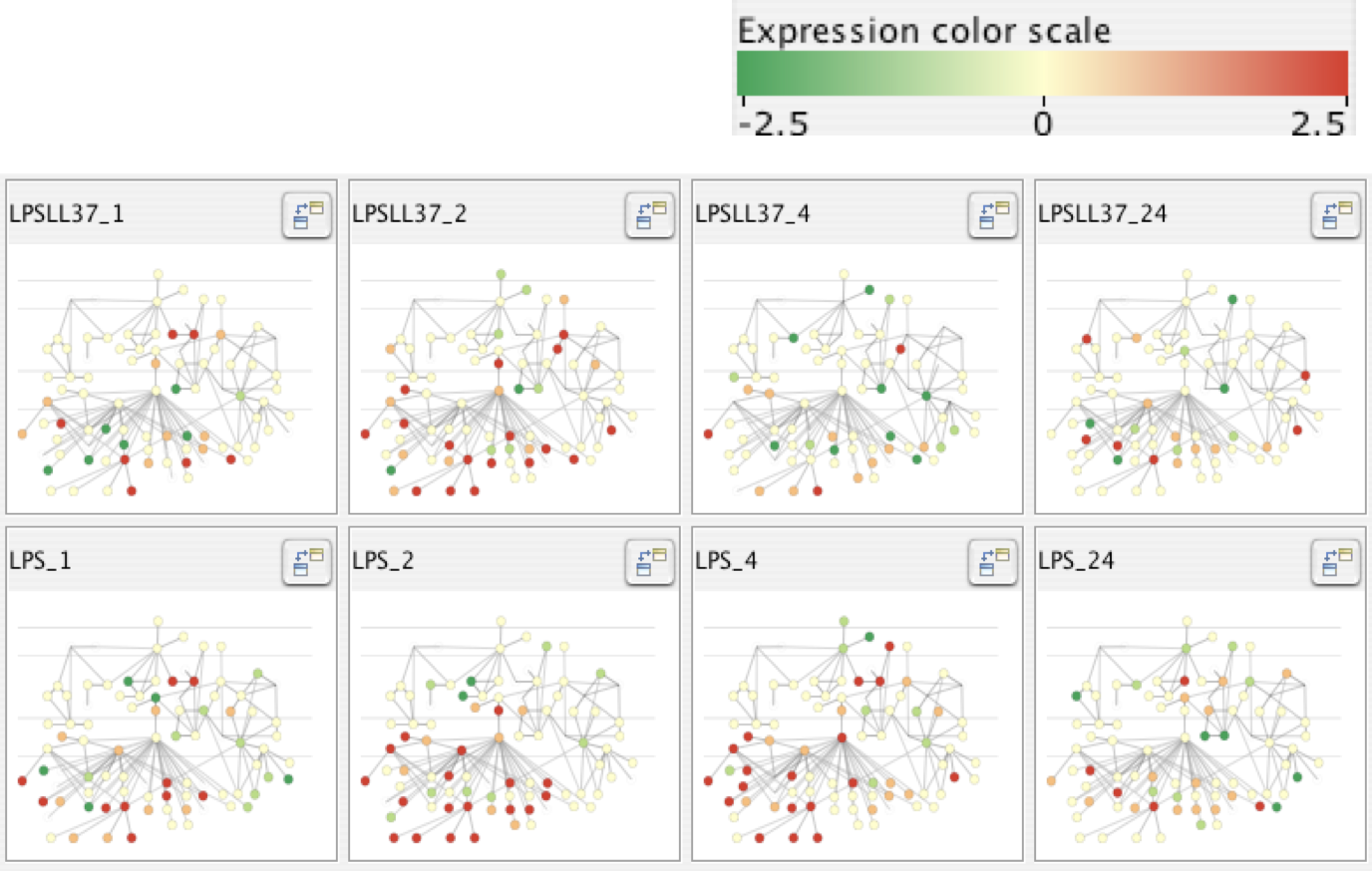
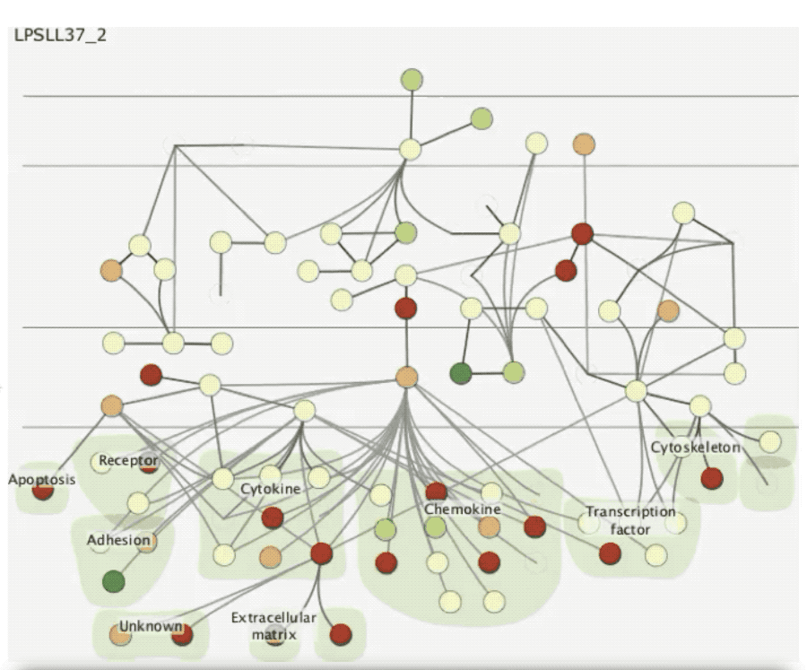
Example: Cerebral
- Small multiples: one graph instance per experimental condition
- Same spatial layout
- Color differently, by condition
Why Not Animation?
- Disparate frames and regions: comparison difficult
- Vs. contiguous frames
- Vs. small region
- Vs. coherent motion of group
- Safe special case
- Animated transitions
Change Blindness
If attention is directed elsewhere, even drastic changes not noticeable
Resolution Beats Immersion
- Immersion typically not helpful for abstract data
- Do not need sense of presence or stereoscopic 3D
- Desktop also better for workflow integration
- Resolution much more important: pixels are the scarcest resource
- Virtual reality for abstract data difficult to justify thus far
- But stay tuned with second wave
Visualization Mantra
Visualization Mantra
- Overview first, zoom and filter, then details on demand
- Overview first, zoom and filter, then details on demand
- Overview first, zoom and filter, then details on demand
- Overview first, zoom and filter, then details on demand
- Overview first, zoom and filter, then details on demand
- Overview first, zoom and filter, then details on demand
- Overview first, zoom and filter, then details on demand
- Overview first, zoom and filter, then details on demand
- Overview first, zoom and filter, then details on demand
- Overview first, zoom and filter, then details on demand
[The Eyes Have It: A Task by Data Type Taxonomy for Information Visualizations. Shneiderman. Proc. IEEE Visual Languages, pp. 336–343, 1996.]
Overview
- Overview 👉 summary
- Microcosm of full visualization design problems
- Useful for exploration
Overview 👉 Zoom
Overview 👉 Filtering
Bottom-Up?
- Sometimes makes sense to start small
- Useful for presentation
- Common in storytelling
- Helps explaining complex concepts
Function First,
Form Next
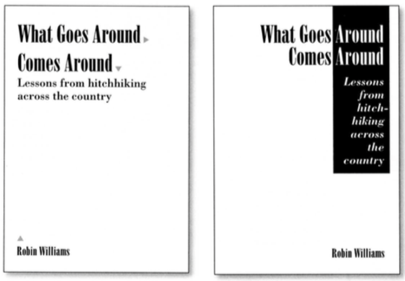
Function First
- Start with focus on functionality
- Possible to improve aesthetics later on, as refinement
- If no expertise, seek for help from graphic designers
- Dangerous to start with aesthetics
- Usually impossible to add function retroactively
[The Non-Designer’s Design Book. Robin Williams. 3rd edition. Peachpit Press, 2008.]
Aesthetics Do Matter
- Another level of function
- Visual hierarchy, alignment, flow
- Gestalt principles in action
- Very important for the enjoy task
[The Non-Designer’s Design Book. Robin Williams. 3rd edition. Peachpit Press, 2008.]
Responsiveness Is Required
Visual feedback: three rough categories
- 0.1 seconds: perceptual processing
- Subsecond response for mouseover highlighting: ballistic motion
- 1 second: immediate response
- Fast response after mouseclick, button press: Fitts’s Law limits on motor control
- 10 seconds: brief tasks
- Bounded response after dialog box: mental model of heavyweight operation (file load)
Scalability Considerations
- Highlight selection without complete redraw of view (graphics frontbuffer)
- Show ⏳ for multi-second operations (check for cancel/undo)
- Show progress bar for long operations (process in background thread)
- Rendering speed when item count is large (guaranteed frame rate)
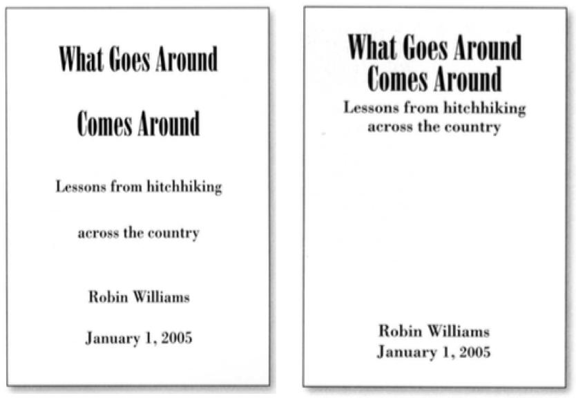
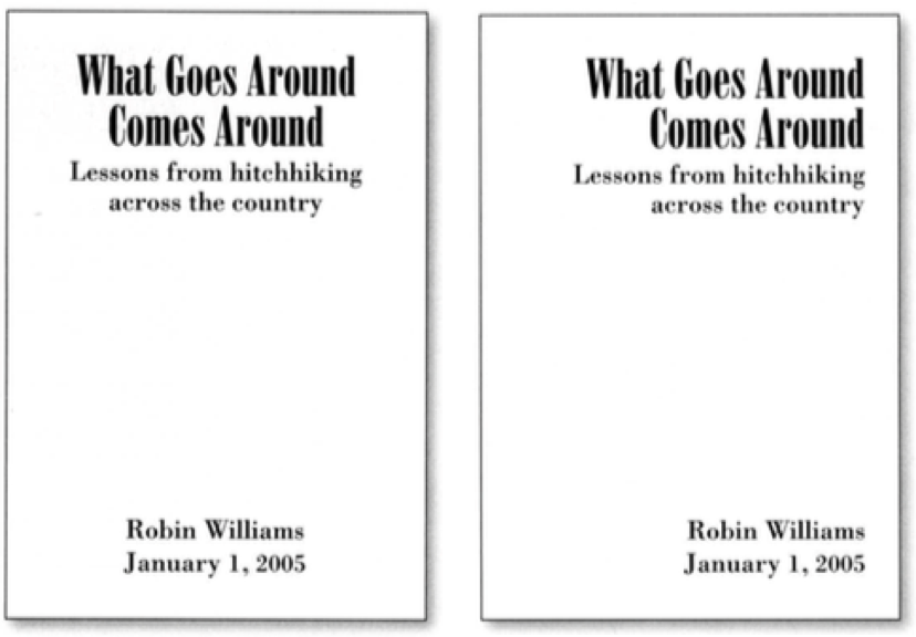
Basic Design Principles
Basic Design Principles
- Proximity
- Alignment
- Repetition
- Contrast
Proximity
- Do group related items together
- Avoid equal whitespace between unrelated
Alignment
- Do find/make strong line, stick to it
- Avoid automatic centering
Repetition
- Do unify by pushing existing consistencies
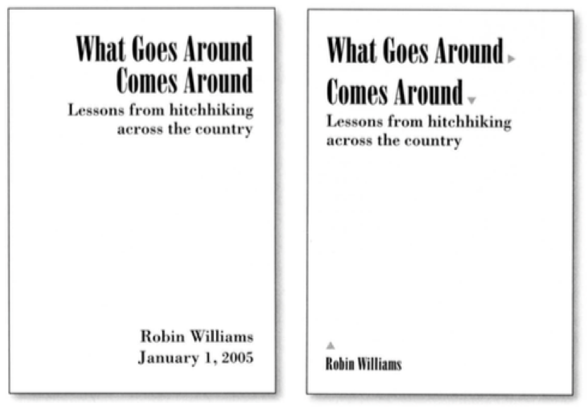
Contrast
- If not identical, then very different
- Avoid similar
Labels and Axis
Labeling
- Make visualizations as self-documenting as possible
- Meaningful and useful title, labels, legends
Labeling (cont.)
- Axes and panes/subwindows should have labels
- And axes should have good mix/max boundary tick marks
- Everything that’s plotted should have a legend
- And own header/labels if not redundant with main title
- Use reasonable numerical format
- Avoid scientific notation in most cases
Avoid Dual Axis
- Apples vs. oranges
- Which one is which?
Be Careful with Aggregations
- Mean vs. median
- Show standard deviations
- Show uncertainty
- Does the aggregation make sense?
- Cars and motorcycles have, on average, three wheels
- Summing up grades (instead of averaging)
Normalize
- When comparing, using a common metric
- Usually percent
- Always state percent to what
Ethics


What We Learned
- No unjustified 3D or 2D
- Readable text
- Eyes beat memory
- Visualization mantra
- Responsiveness is required
- Function first, form next