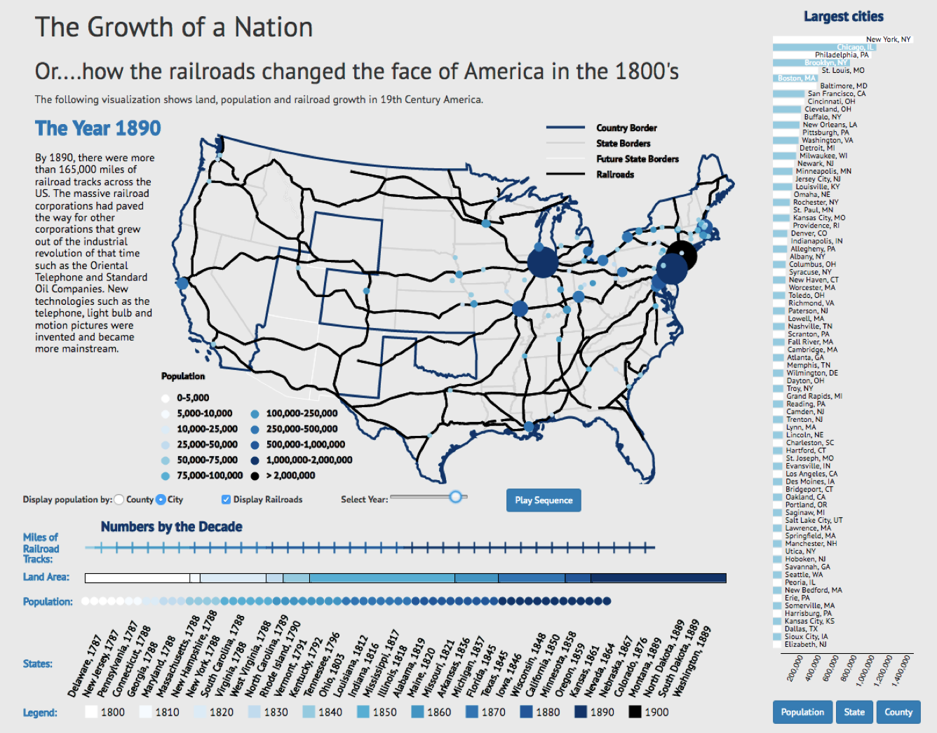
Manipulate Views
MIDS W209: Information Visualization
John Alexis Guerra Gómez | john.guerra[at]gmail.com | @duto_guerra
Andy Reagan | andy[at]andyreagan.com |@andyreagan
https://johnguerra.co/lectures/MIDS_W209_Information_Visualization/10_Manipulate_Views/
Andy Reagan | andy[at]andyreagan.com |@andyreagan
https://johnguerra.co/lectures/MIDS_W209_Information_Visualization/10_Manipulate_Views/
Partially based on slides from Tamara Munzner
What We Are Going to Learn
- Manipulate views
- Change encodings/parameters
- Animations
- Interactions
- Navigate
- Case studies

Manipulate Views
How to Handle Complexity
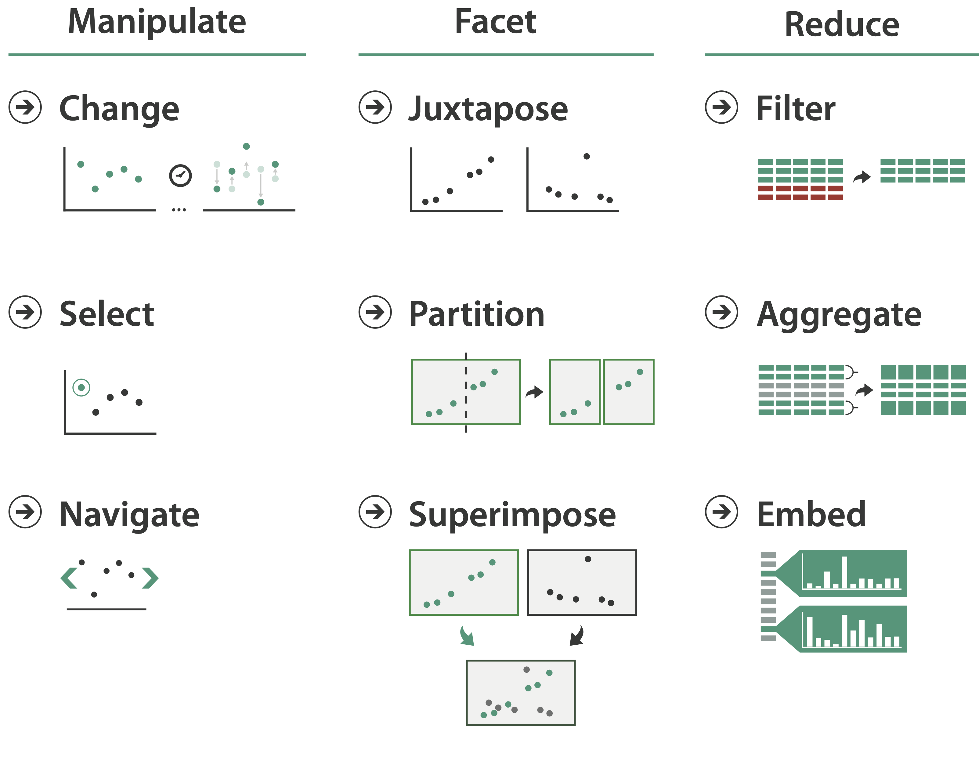
Three strategies
- Change view over time
- Facet across multiple views
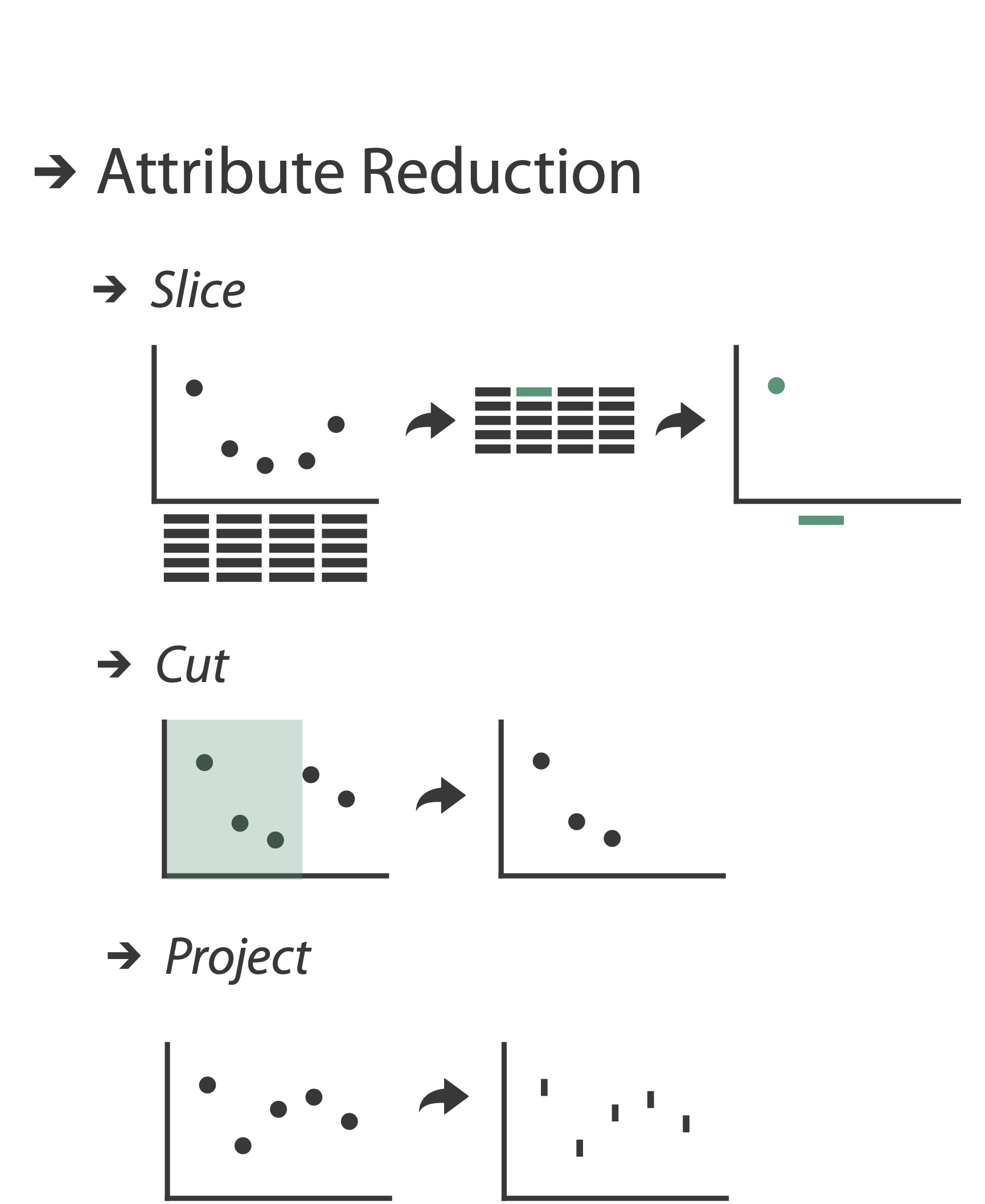
- Reduce items/attributes within single view
And one previous
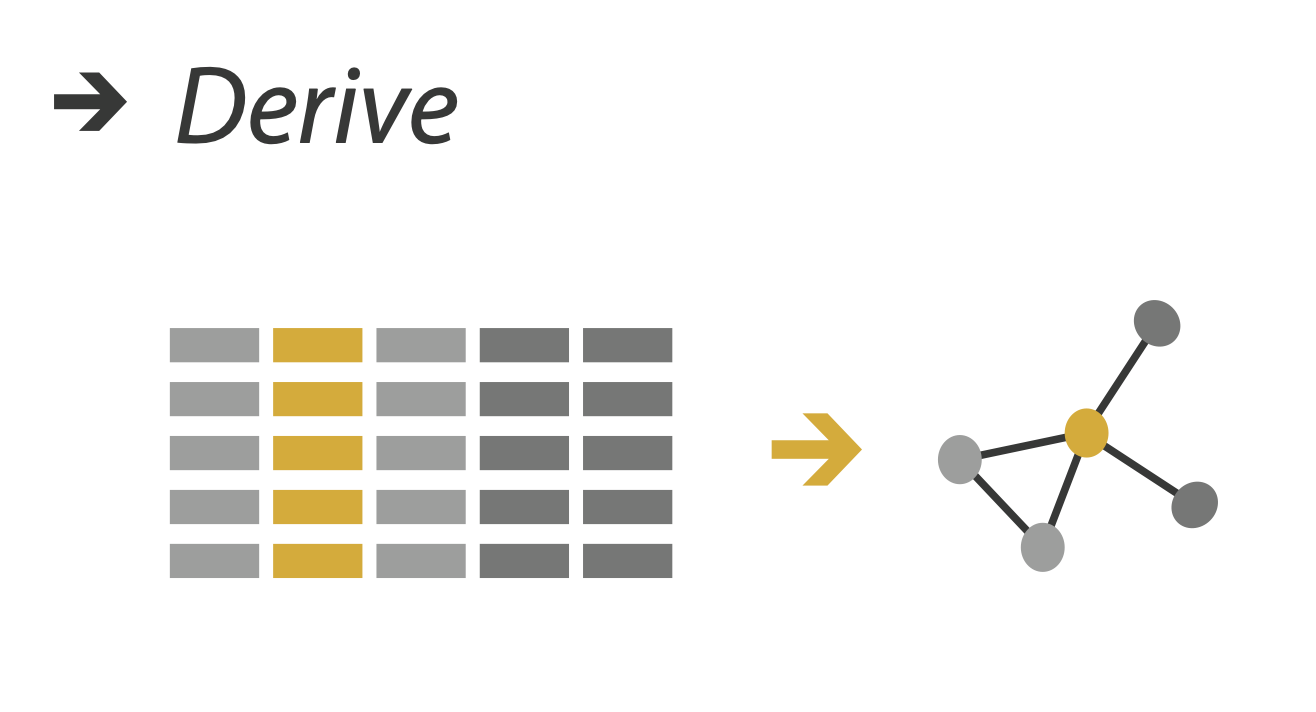
- Derive new data to show within view
![derive]()
Strategies
- Change view over time 👈 most obvious one: interaction
- Facet
- Reduce
- Derive
Manipulate
Change Over Time
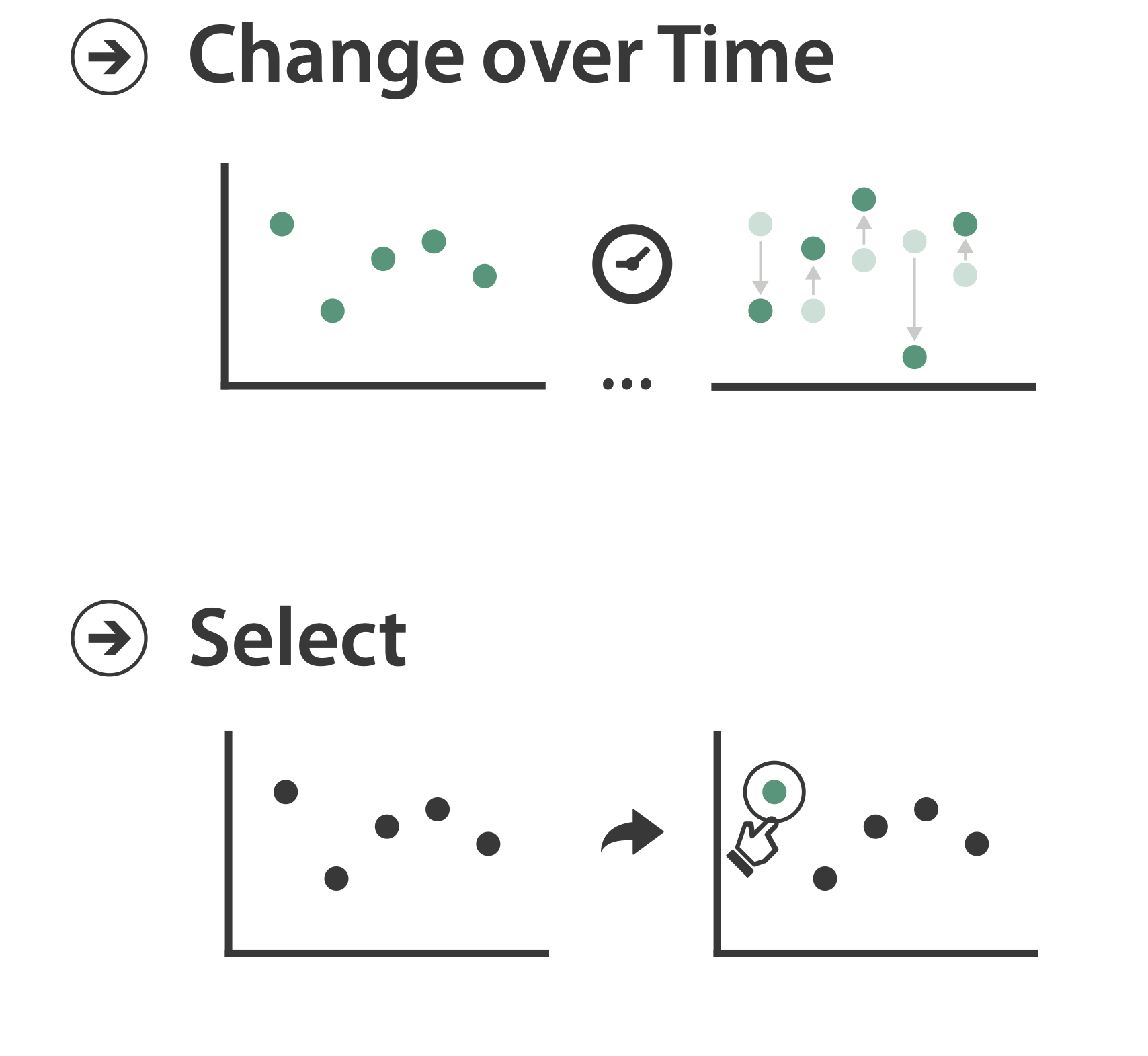
- Change any of the other choices
- Encoding itself
- Parameters
- Arrange: rearrange reorder
- Aggregation level, what is filtered...
- Interaction entails change

Change Encoding/Parameters
Change Encoding
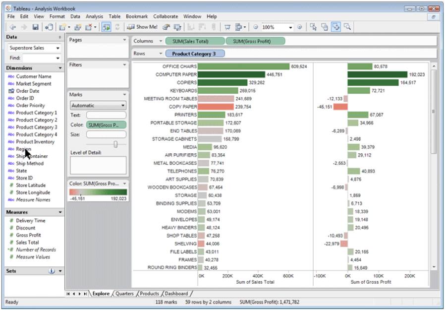
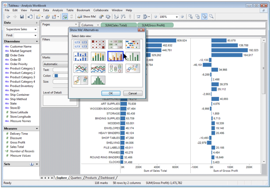
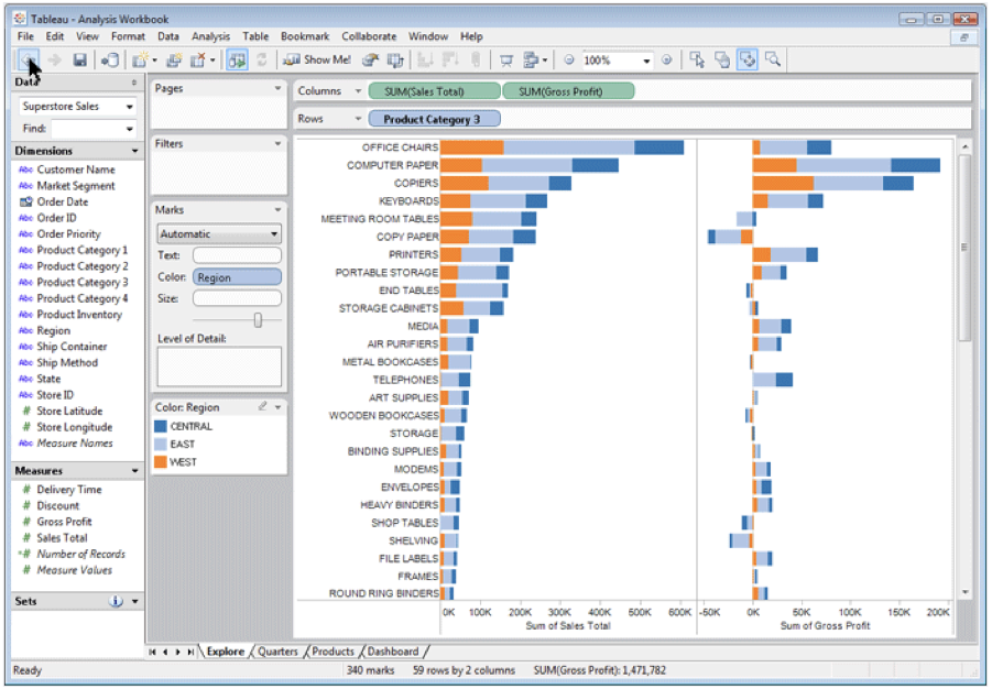
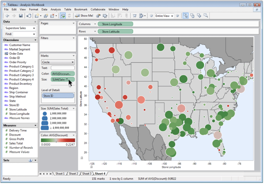
Change Encoding: Vega-Lite
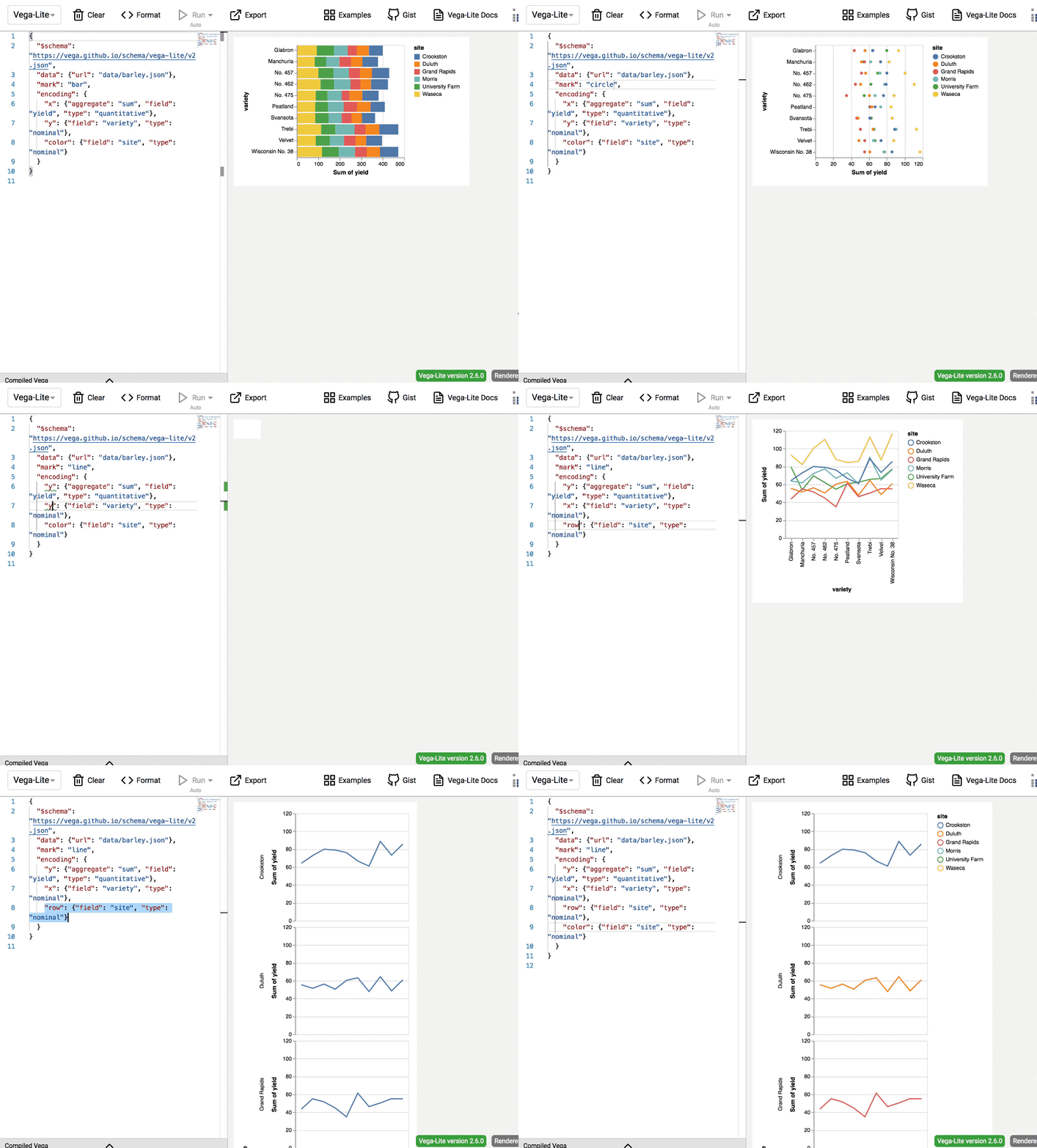
Not so easy in D3 🤷🏼♂️
Change Parameters
- Widgets and controls:
- Sliders, buttons, radio buttons, checkboxes, dropdowns/comboboxes
- Pros:
- Clear affordances, self-documenting (with labels)
- Cons:
- Uses screen space
- Design choices:
- Separated vs. interleaved
- Controls and canvas
- Separated vs. interleaved
Slide inspired by: Alexander Lex, Utah

Case Study: Changing Encoding and Parameters
Hedonometer.org
Line Chart Changes
- Change time parameter using brush
- Change time parameter using menu
- Change encoding of day-of-week using menu
Word Shift Graph Changes
- Change time parameter with menu and date picker
- Change language parameter with translation toggle
- Change position encoding with bar selector
Demo

Animations
Reorder: DataStripes
- What: table with many attributes
- How: data-driven reordering by selecting column
- Why: find correlations between attributes

Re-Align: LineUp
- Stacked bars
- Easy to compare
- First segment
- Total bar
- Align to different segment
- Supports flexible comparison
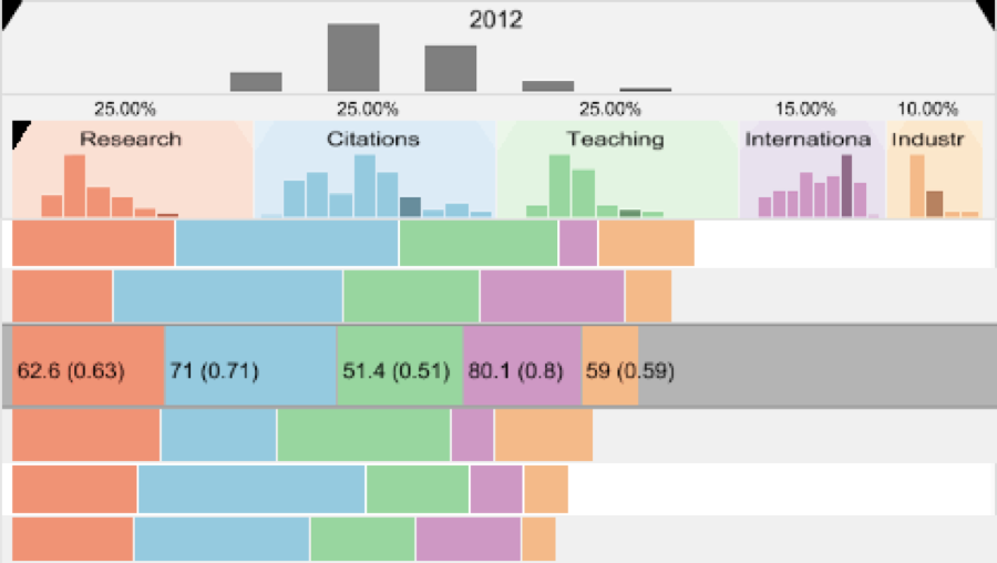
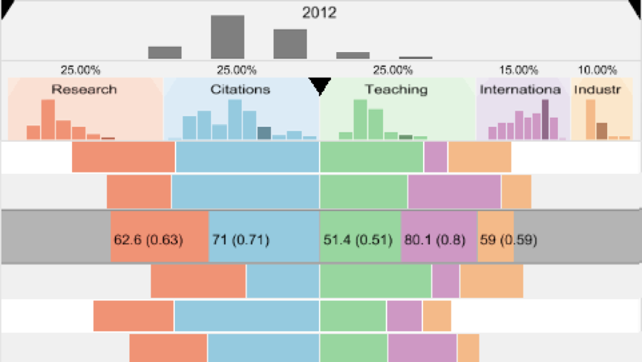
LineUp
http://vcg.seas.harvard.edu/files/pfister/files/2013_infovis_lineup.mp4"LineUP" d 3
https://observablehq.com/@john-guerra/lineupIdiom: Animated Transitions
- Smooth interpolation from one state to another
- Alternative to jump cuts, supports item tracking
- Best case for animation
- Staging to reduce cognitive load
- Example: animated transitions in statistical data graphics
D3 Show Reel
Animating the Show Reel: Flubber
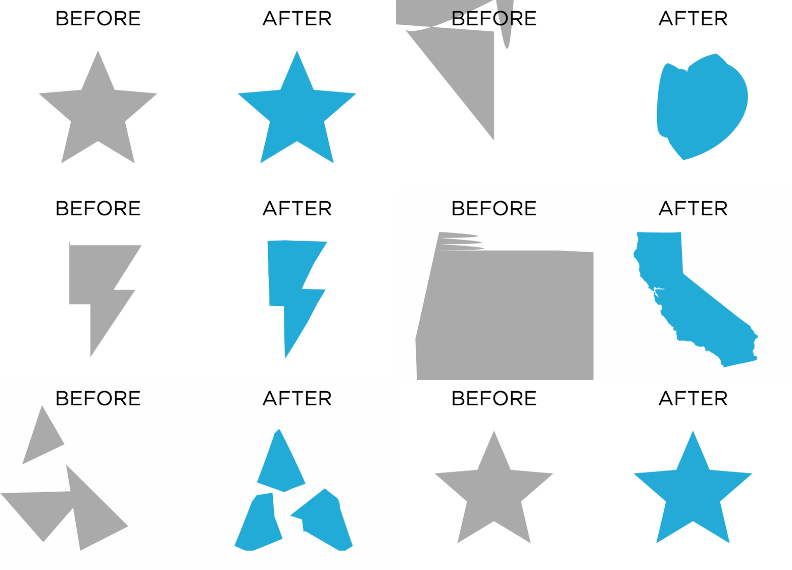
Collapsible Tree
Zoomable Bar Chart
Zoomable Icicle

Interactions
Selection
- Selection: basic operation for most interaction
- Design choices
- How many selection types?
- Interaction modalities
- Click/tap (heavyweight) vs. hover (lightweight but not available on most touchscreens)
- Multiple click types (shift-click, option-click, etc.)
- Proximity beyond click/hover (touching vs. nearby vs. distant)
- Application semantics
- Adding to selection set vs. replacing selection
- Can selection be null?
- Example: toggle so nothing selected if click on background
- Primary vs. secondary (example: source/target nodes in network)
- Group membership (add/delete items, name group, etc.)
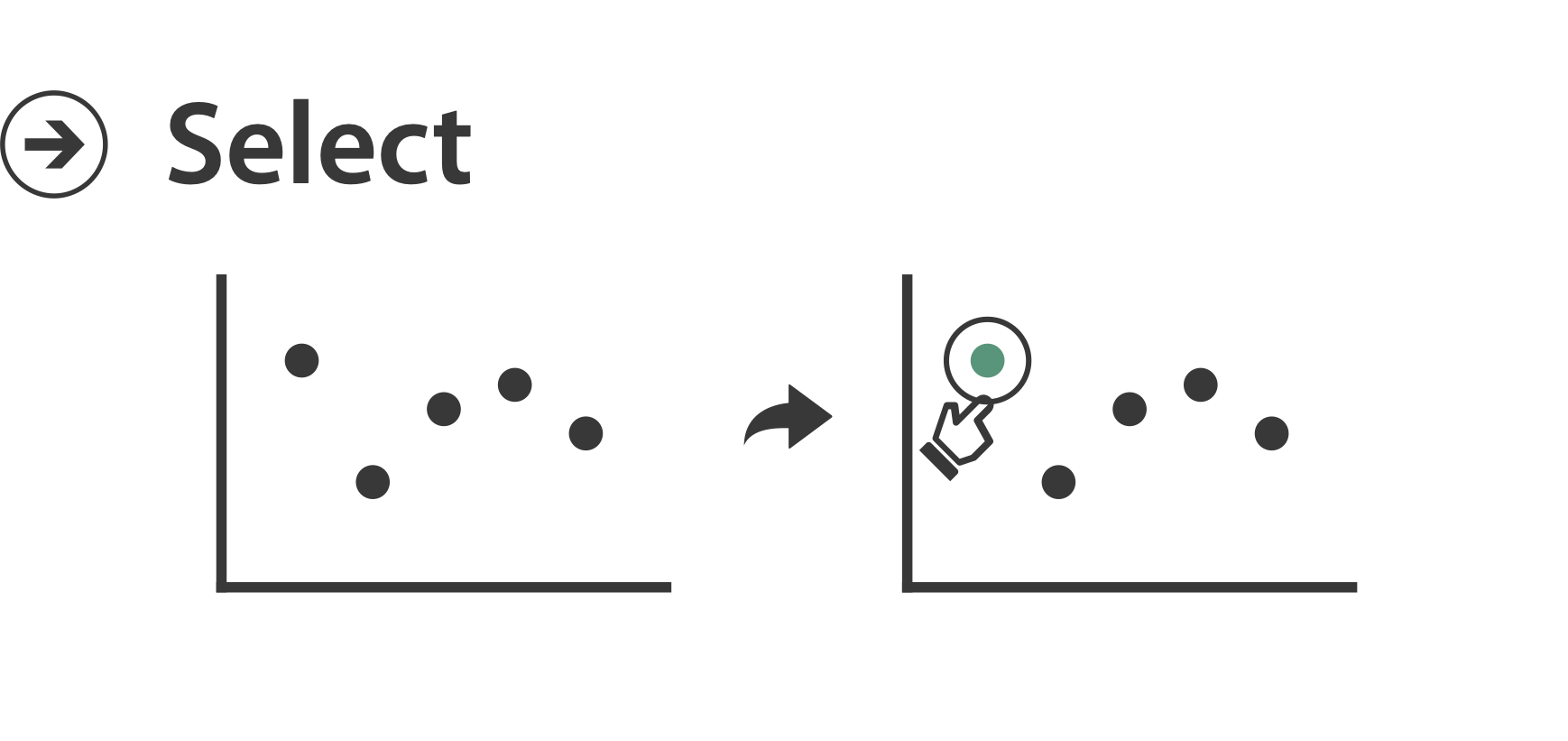
Types of Selection
- Interval:
- Brush 1D
- Brush 2D
- Individual:
- Closest item (hover)
- Click to select
- Multi:
- Shift-click
- By similarity (e.g., connection, same state)
Voronoi Maps
Highlight
- Highlight: change visual encoding for selection targets
- Visual feedback closely tied to but separable from selection (interaction)
- Design choices: typical visual channels
- Change item color
- But hides existing color coding
- Add outline mark
- Change size (example: increase outline mark linewidth)
- Change shape (example: from solid to dashed line for link mark)
- Change item color
- Unusual channels: motion
- Motion: usually avoid for single view
- With multiple views, could justify to draw attention to other views
- Motion: usually avoid for single view
Interaction Technology
- What do you design for?
- Mouse and keyboard on desktop?
- Large screens, hover, multiple clicks
- Touch interaction on mobile?
- Small screens, no hover, just tap
- Gestures from video/sensors?
- Ergonomic reality vs. movie bombast
- Eye tracking?
- Mouse and keyboard on desktop?
Slide inspired by: Alexander Lex, Utah
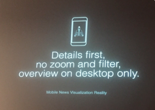
Data visualization and the news - Gregor Aisch (37 min)
https://vimeo.com/182590214

I Hate Tom Cruise - Alex Kauffmann (5 min)
https://www.youtube.com/watch?v=QXLfT9sFcbc
Tooltips
- Popup information for selection
- Hover or click
- Can provide useful additional detail on demand
- Beware: does not support overview!
- Always consider if there’s a way to visually encode directly to provide overview.
- "If you make a rollover or tooltip, assume nobody will see it. If it's important, make it explicit."
- Gregor Aisch, NYTimes
Responsiveness is Required
- Visual feedback: three rough categories
- 0.1 seconds: perceptual processing
- Subsecond response for mouseover highlighting: ballistic motion
- 1 second: immediate response
- Fast response after mouseclick, button press: Fitts’ Law limits on motor control
- 10 seconds: brief tasks
- Bounded response after dialog box: mental model of heavyweight operation (file load)
- 0.1 seconds: perceptual processing
- Scalability considerations
- Highlight selection without complete redraw of view (graphics frontbuffer)
- Show hourglass for multi-second operations (check for cancel/undo)
- Show progress bar for long operations (process in background thread)
- Rendering speed when item count is large (guaranteed frame rate)

Navigate
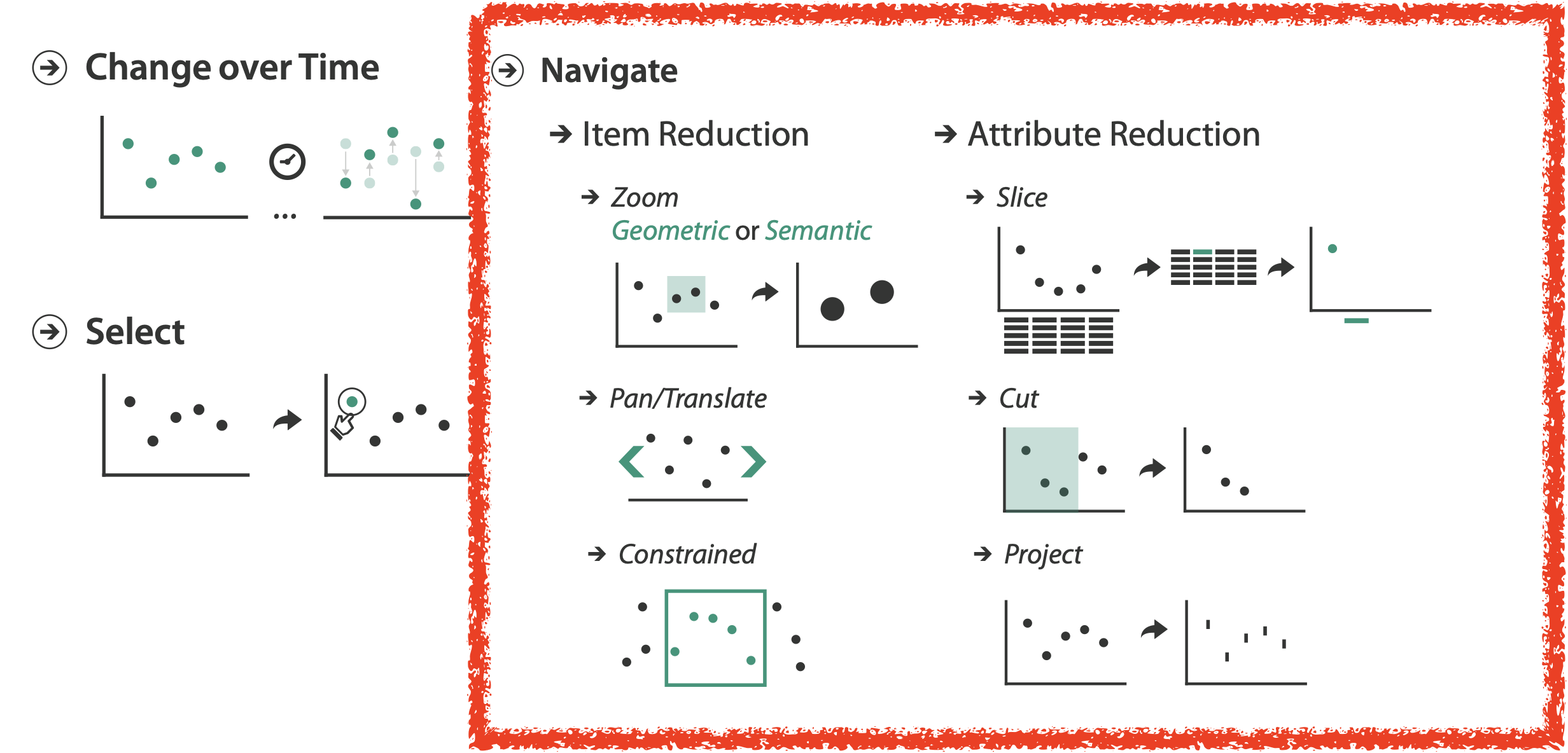
Navigate: Changing Viewpoint/Visibility
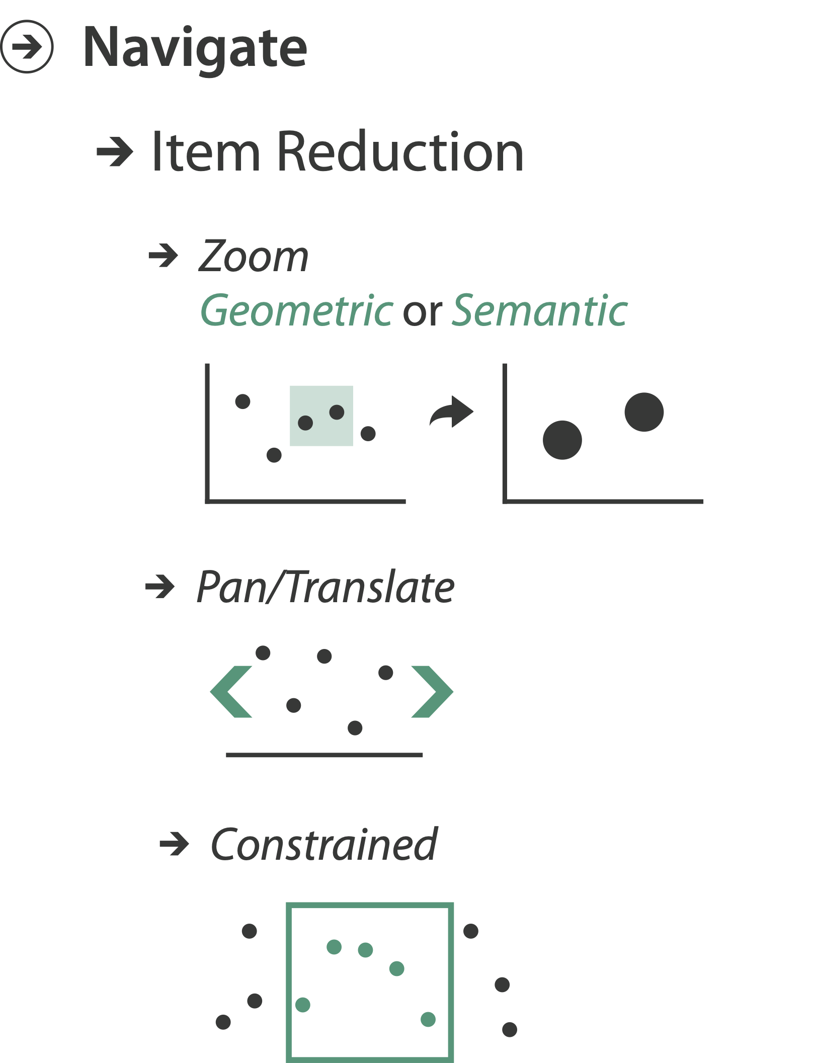
- Change viewpoint
- Changes which items are visible within view
- Camera metaphor
- Pan/translate/scroll
- Rotate
- Zoom
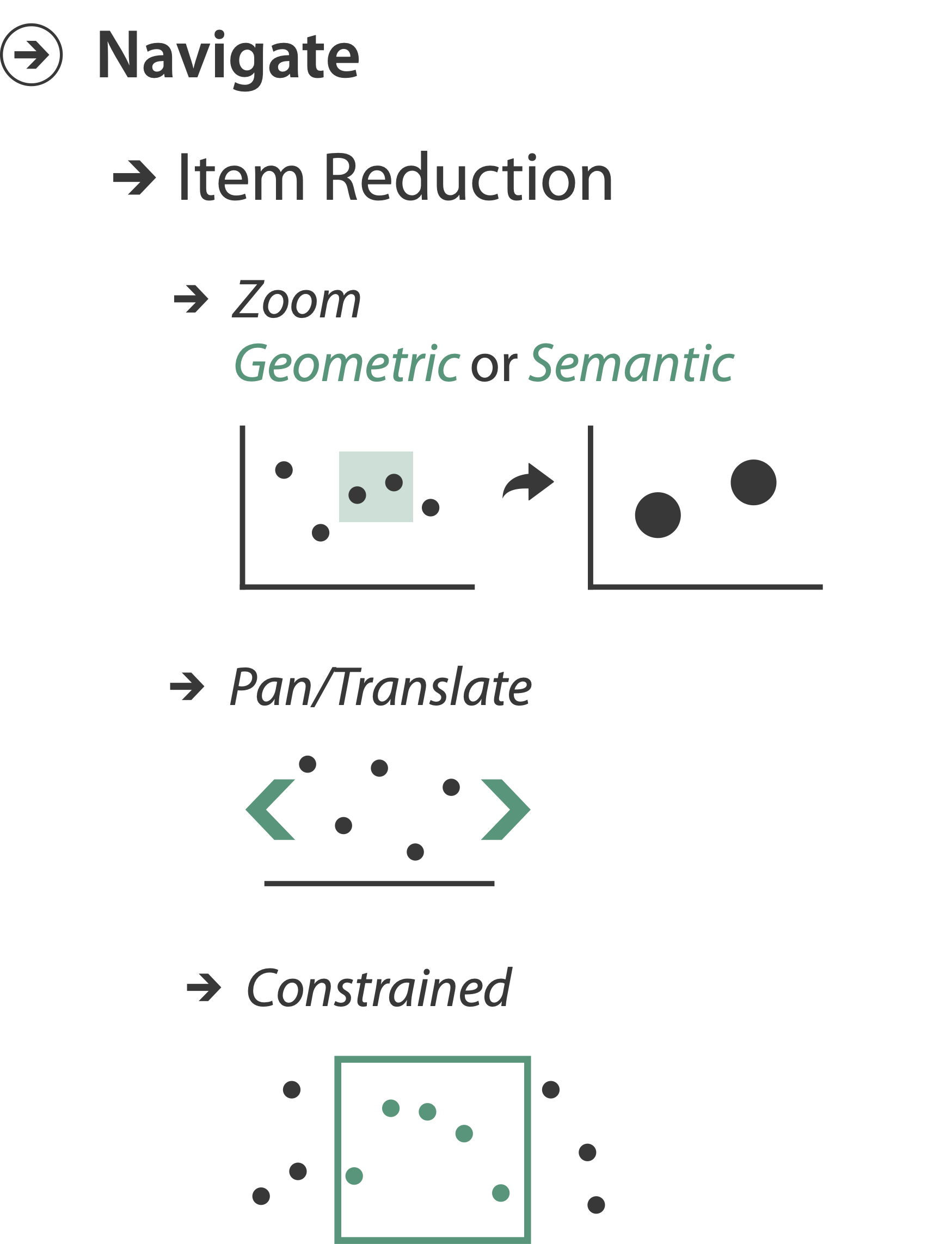
Pan/Translate/Scroll
- Move up/down
- Move sideways
- Go to location
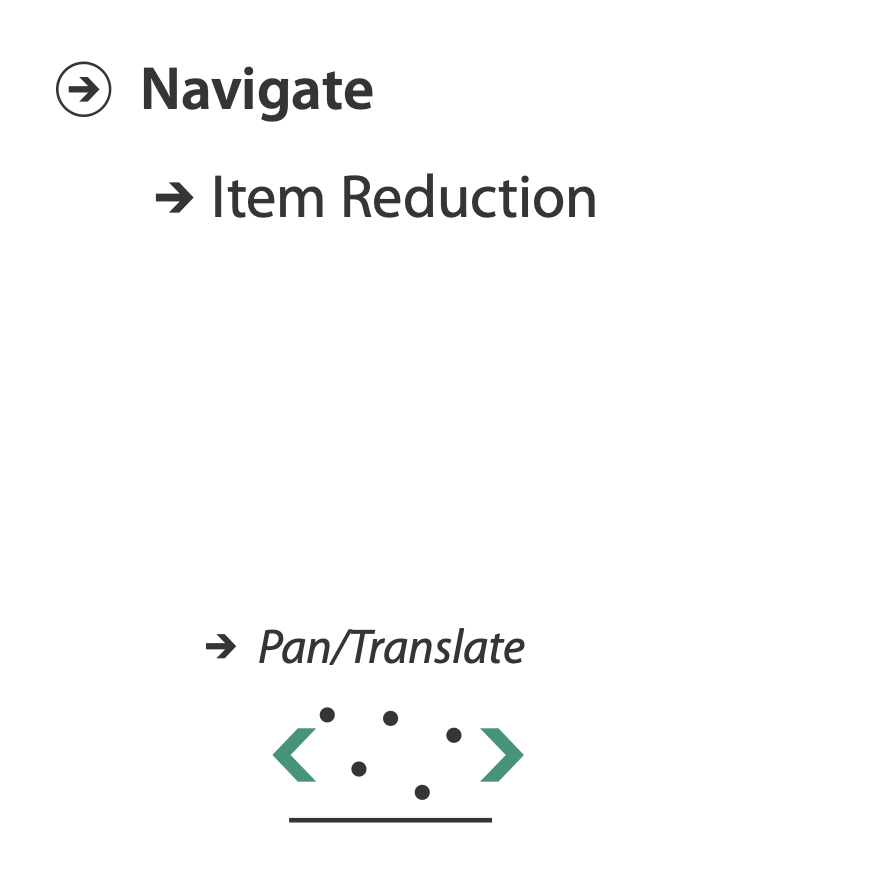
Idiom: Scrollytelling
- How: navigate page by scrolling (panning down)
- Pros:
- People don't click, but they scroll
- Bottom-up approach
- Good for mobile
- Cons:
- Full-screen mode may lack affordances
- Scrolljacking, no direct access
- Unexpected behaviour
- Continuous control for discrete steps
- Eagereyes take on scrollytelling
- MBostock's guidelines for scrollytelling
Slide inspired by: Alexander Lex, Utah
Zoom
- Enlarge/shrink world: move camera closer/further
- Geometric zoom: standard, like moving physical object
- Semantic zoom: keep objects same size, but change the scale/viewport
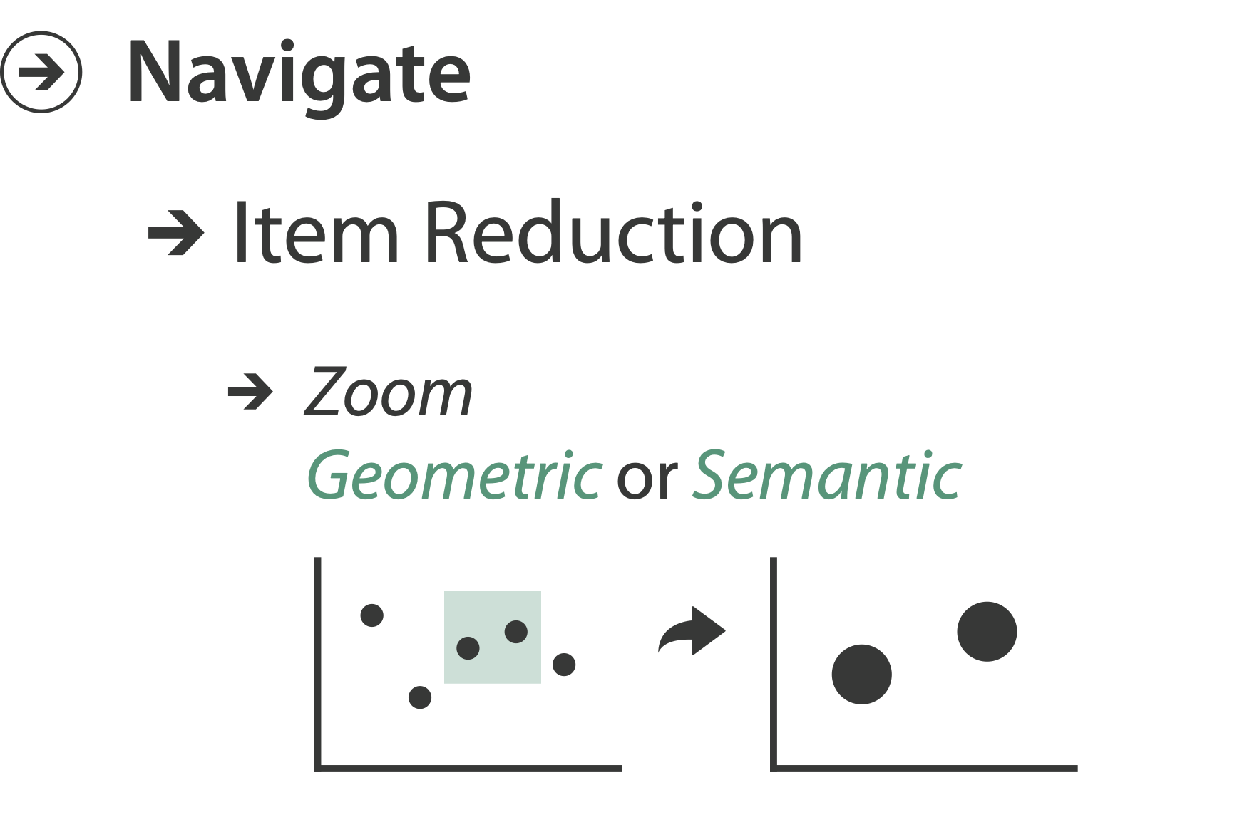
Idiom: Semantic Zooming
- Semantic Zoom
- Alternative to geometric zoom
- Resolution-aware layout adapts to available space
- Goal: legible at multiple scales
- Dramatic or subtle effects
- Visual encoding change
- Colored box
- Sparkline
- Simple line chart
- Full chart: axes and tickmarks
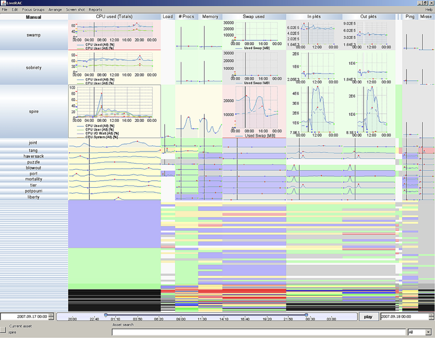
LiveRAC
Geometric Zoom
Semantic Zoom
Rotate
Zoom to Constrained
Transition and Animated Navigation
Barchart Race
Interaction Benefits
- Interaction Pros
- Major advantage of computer-based vs. paper-based visualization
- Flexible, powerful, intuitive
- Exploratory data analysis: change as you go during analysis process
- Fluid task switching: different visual encodings support different tasks
- Animated transitions provide excellent support
- Empirical evidence that animated transitions help people stay oriented
Interaction Limitations
- Interaction has a time cost.
- Sometimes minor, sometimes significant
- Degenerates to human-powered search in worst case
- Remembering previous state imposes cognitive load
- Rule of thumb: eyes over memory.
- Hard to compare visible item to memory of what you saw
- Example: maintaining context/orientation when navigating
- Example: tracking complex changes during animation
- Rule of thumb: eyes over memory.
- Controls may take screen real estate.
- Or invisible functionality may be difficult to discover (lack of affordances)
- Users may not interact as planned by designer.
- NYTimes logs show about 90% don’t interact beyond scrollytelling - Aisch, 2016

Manipulate View Case Studies
Colombian Elections
Twitter Influentials
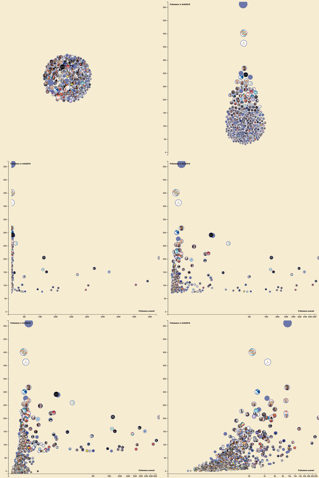

Animations on the Web

What We Learned
- Manipulate views
- Change encodings/parameters
- Animations
- Interactions
- Navigate
- Case Studies

