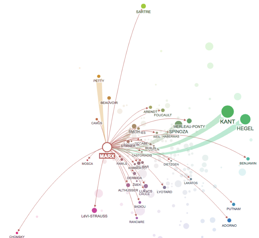
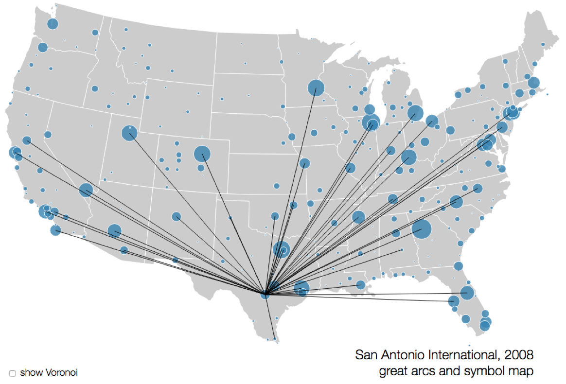
Faceting
MIDS W209: Information Visualization
John Alexis Guerra Gómez | john.guerra[at]gmail.com | @duto_guerra
Andy Reagan | andy[at]andyreagan.com |@andyreagan
https://johnguerra.co/lectures/MIDS_W209_Information_Visualization/11_Faceting/
Andy Reagan | andy[at]andyreagan.com |@andyreagan
https://johnguerra.co/lectures/MIDS_W209_Information_Visualization/11_Faceting/
Partially based on slides from Tamara Munzner
What We Are Going to L earn
- Faceting
- Juxtapose
- Partition
- Superimpose
- Shared data
- Shared encoding
- Shared navigation
- Dashboarding in a box
- Architecture for visualization

Facet Across Multiple Views
Facet
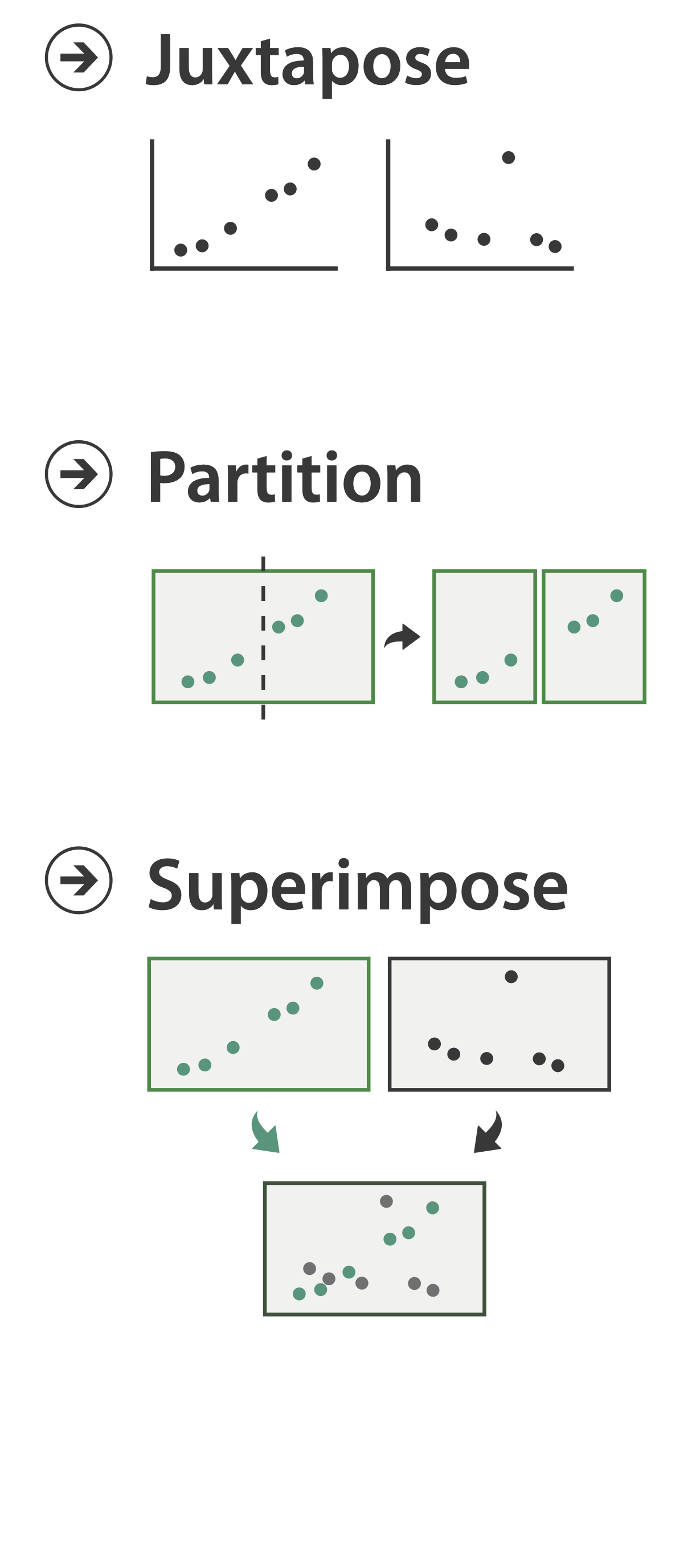

Juxtapose
Juxtapose and Coordinate Views

Coordinate Views:
Design Choice Interaction
Juxtapose
- Design choices
- View count
- Few vs. many
- View visibility
- View arrangment
- User-managed vs. system-aligned
- View count
- Why juxtapose views?
- Benefits: eyes vs. memory
- Lower cognitive load to move eyes between two views than remembering previous state with single changing view
- Costs: display area, two views side-by-side each have only half the area of one view
- Benefits: eyes vs. memory

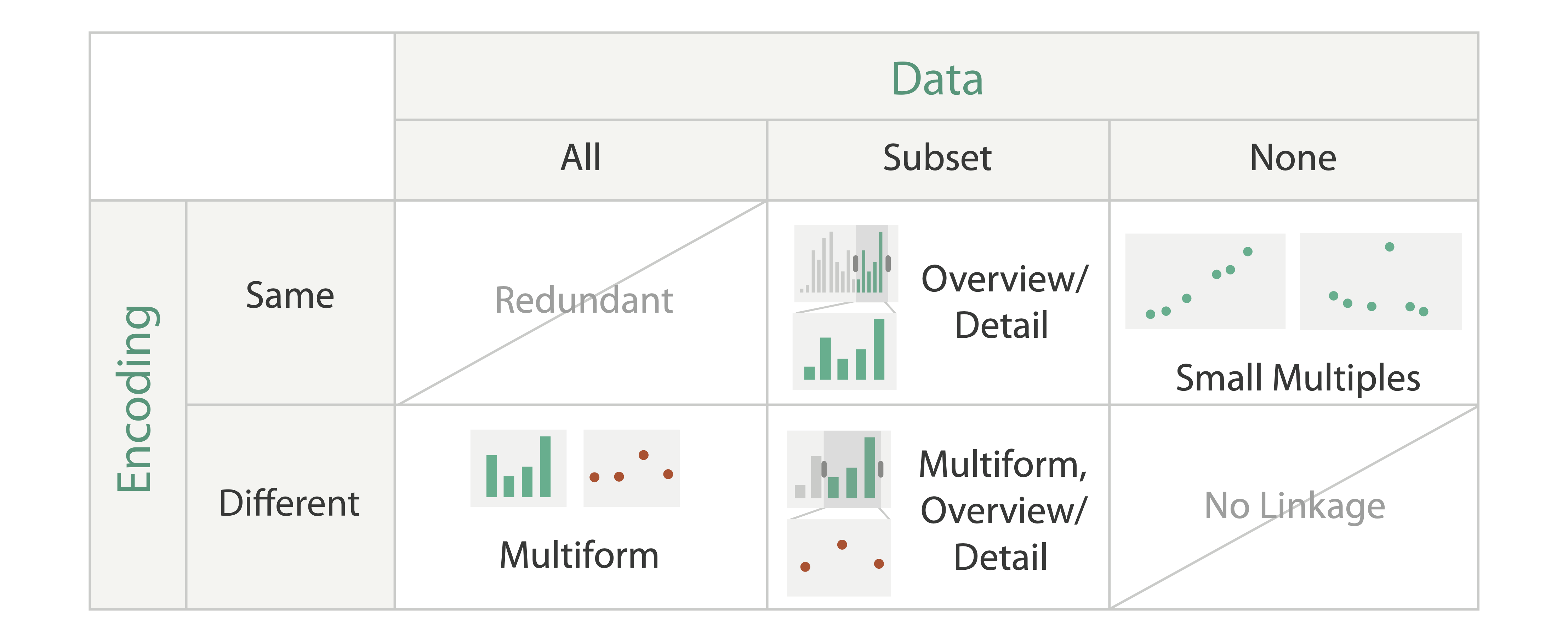
Share Encoding
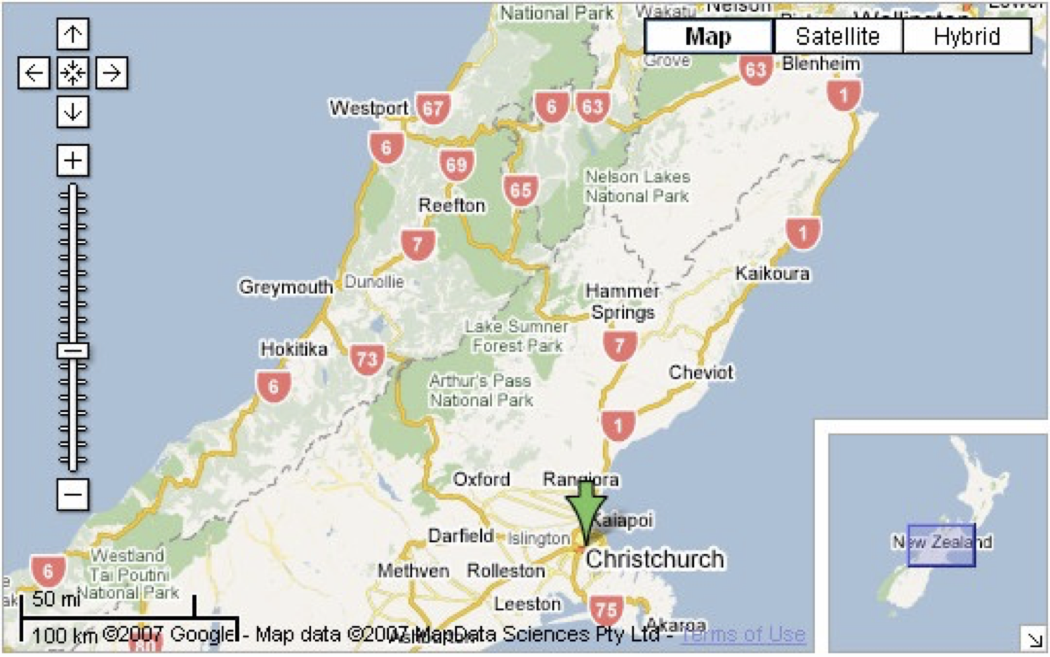
Idiom: Overivew-Detail Views
System: Google Maps
- Encoding: same
- Data: subset shared
- Navigation: shared
- Bi-directional linking
- Differences:
- Viewpoint
- (Size)
- Special case: bird's-eye map
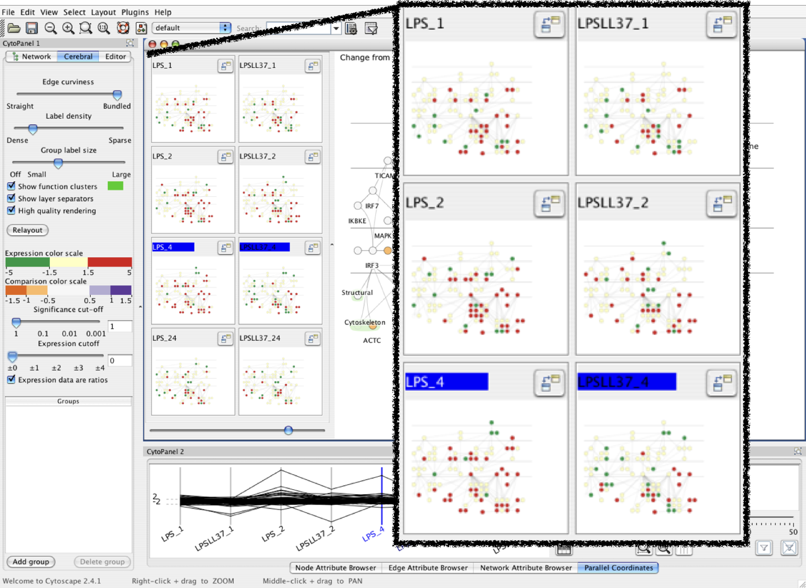
Idiom: Small Multiples
System: cerebral
- Encoding: same
- Data: none shared
- Different attributes for node colors
- (Same network layout)
- Navigation: shared
Focus/Context
Same encoding/subset of data/linked navigation
Small Multiples (Cubism)
Same encoding/different data/linked navigation
http://square.github.io/cubism/demo/
Share Data
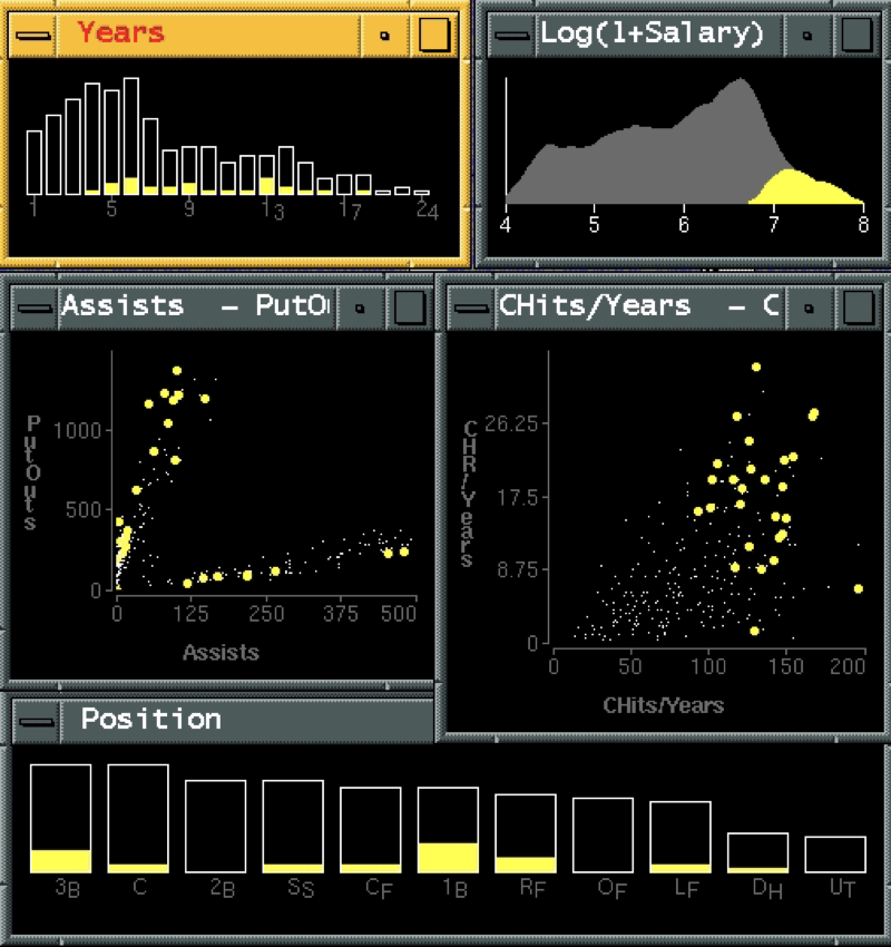
Idiom: Linked Highlighting
System: EDV
- See how regions contiguous in one view are distributed within another
- Powerful and pervasive interaction idiom
- Encoding: different
- Multiform
- Data: all shared
- AKA: brushing and linking
Linked Filtering (Crossfilter)
https://crossfilter.github.io/crossfilter/Multiform Overview/Details
Tweetometro: Different encoding/subset of data/linked navigation
Multiform Overview (Treeversity)
Different encoding/all data/linked navigation
System: Improvise
- Investigate power of multiple views
- Pushing limits on view count, interaction complexity
- How many is okay?
- Open research question
- Reorderable lists
- Easy lookup
- Useful when linked to other encodings
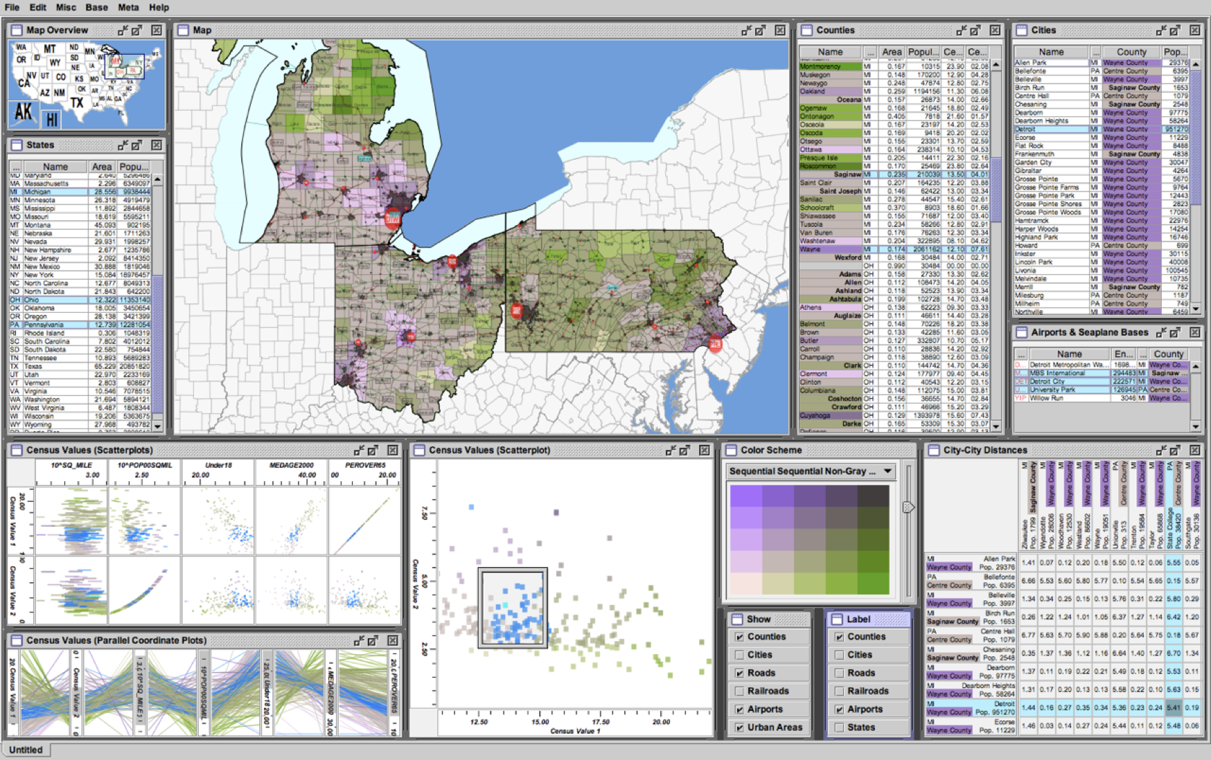
Improvise
http://www.cs.ou.edu/~weaver/improvise/
Share Navigation

Partition
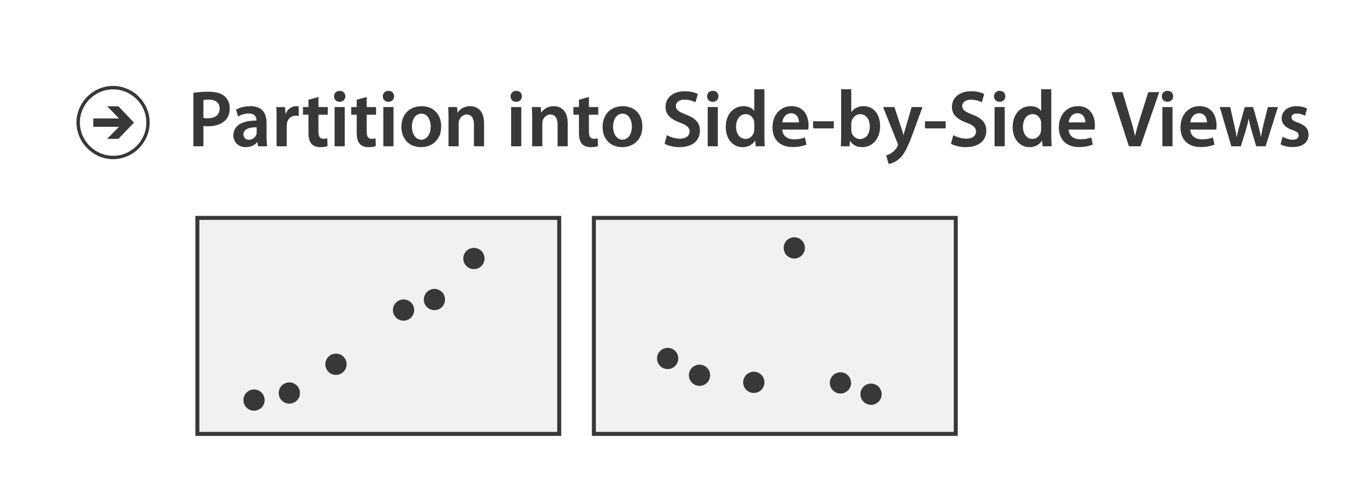
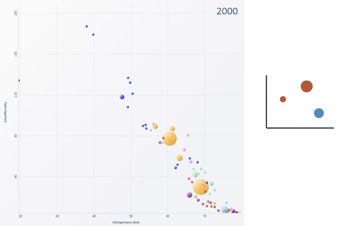
Partition Into Views
- How to divide data between views
- Split into regions by attributes
- Encodes association between items using spatial proximity
- Order of splits has major implications for what patterns are visible
- No strict dividing line
- View: big/detailed
- Contiguous region in which visually encoded data is shown on the display
- Glyph: small/iconic
- Object with internal structure that arises from multiple marks
- View: big/detailed
Partitioning: List Alignment
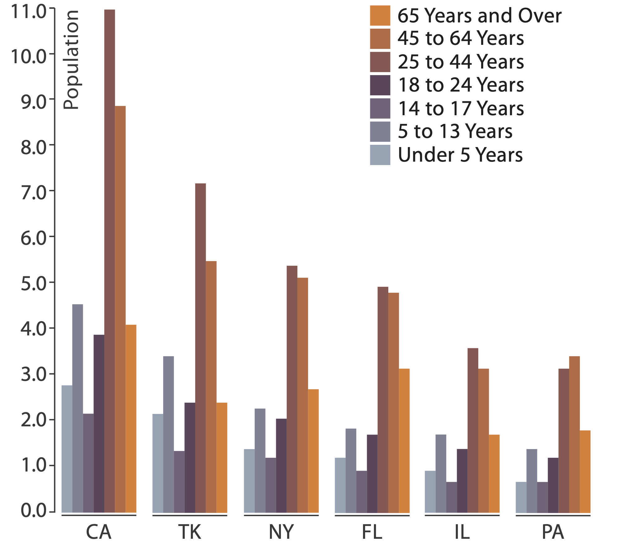
- Single bar chart with grouped bars
- Split by state into regions
- Complex glyph within each region showing all ages
- Compare: easy within state, hard across ages
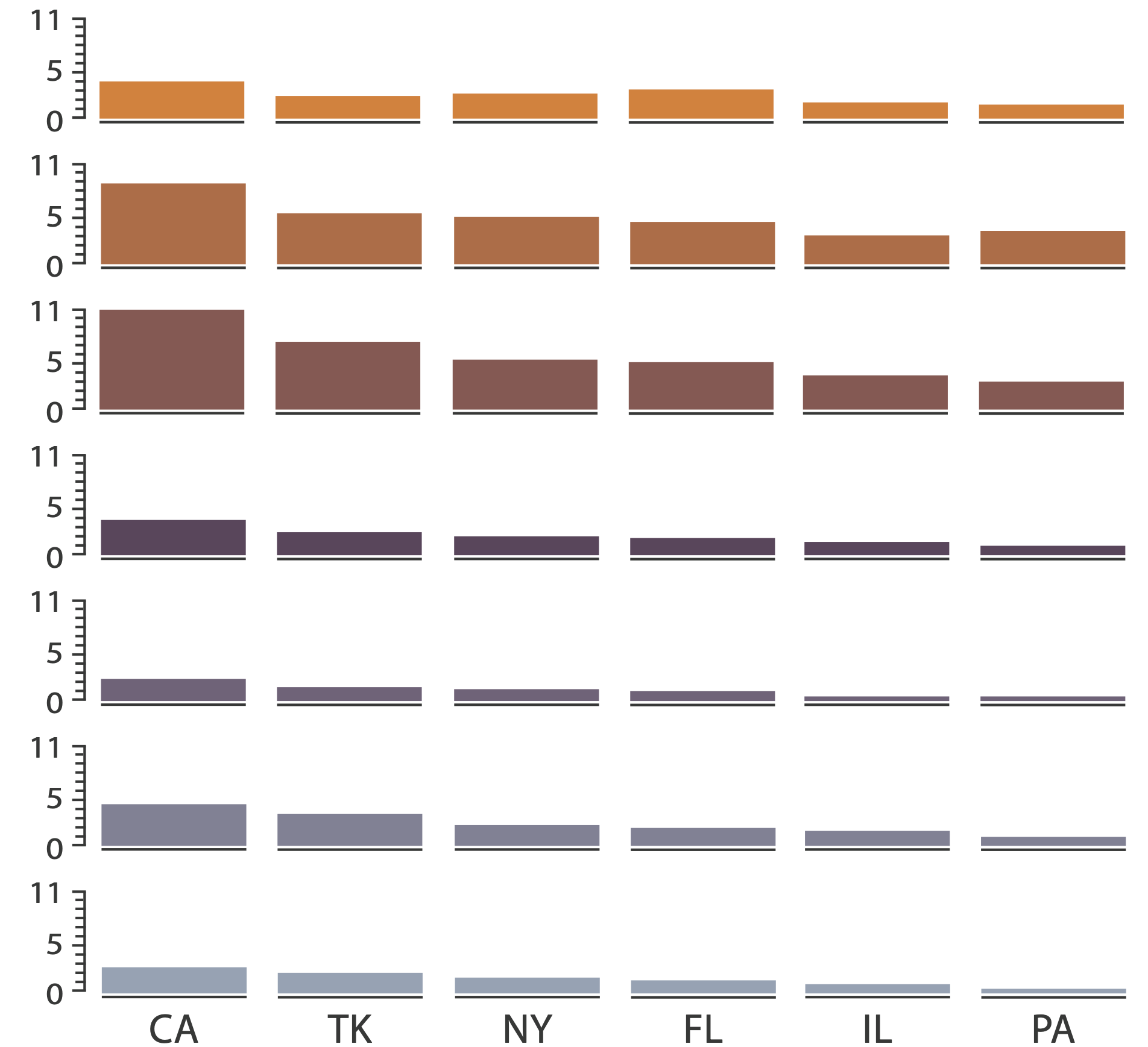
- Small-multiple bar charts
- Split by age into regions
- One chart per region
- Compare: easy within age, harder across states
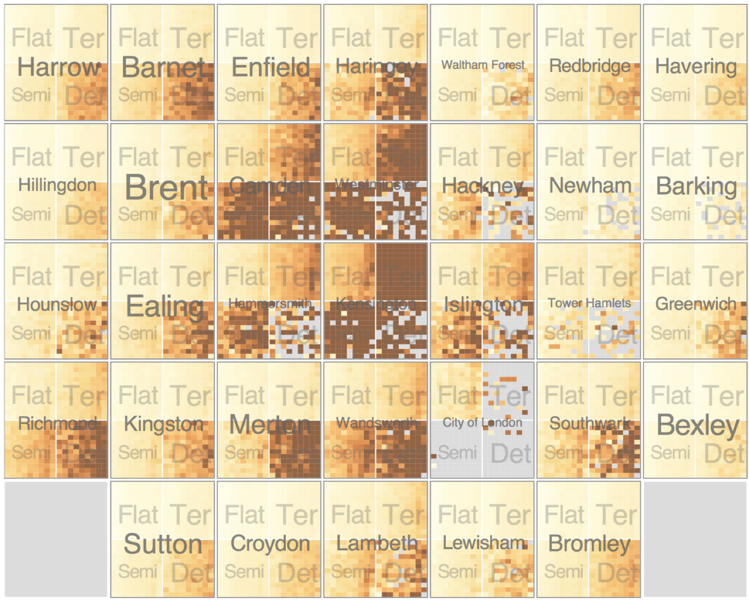
Partitioning: Recursive Subdivision, Part I
System: HIVE
- Split by neighborhood
- Then by type
- Then time
- Years as rows
- Months as columns
- Color by price
- Neighborhood patterns
- Where it’s expensive
- Where you pay much more for detached type
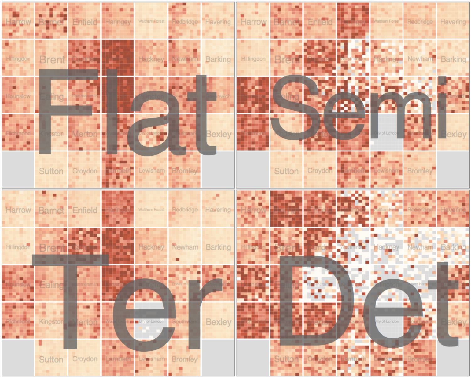
Partitioning: Recursive Subdivision, Part II
System: HIVE
- Switch order of splits
- Type then neighborhood
- Switch color
- By price variation
- Type patterns
- Within specific type, which neighborhoods inconsistent
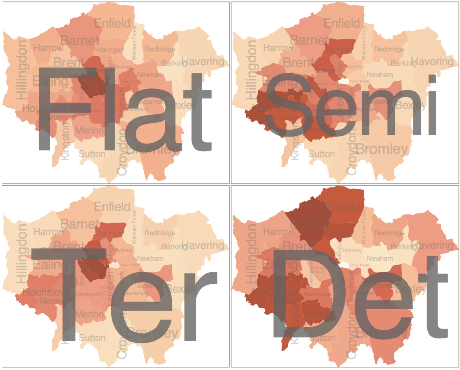
Partitioning: Recursive Subdivision, Part III
System: HIVE
- Different encoding for second-level regions
- Choropleth maps
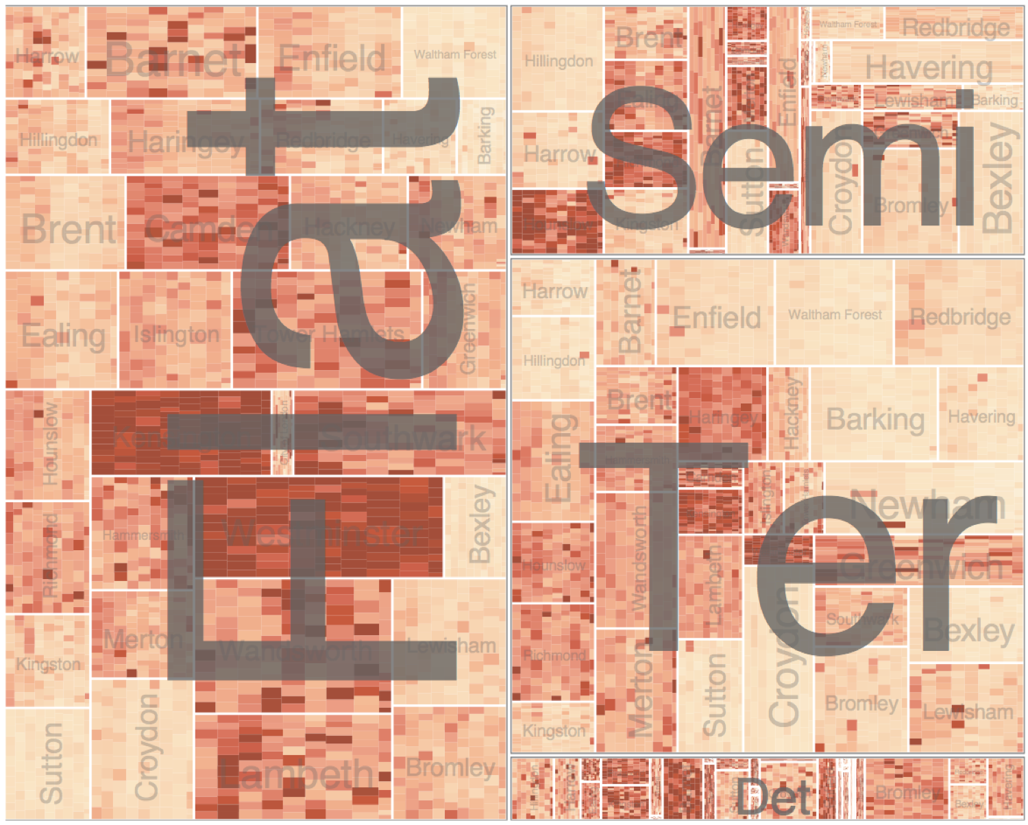
Partitioning: Recursive Subdivision, Part IV
System: HIVE
- Size regions by sale counts
- Not uniformly
- Result: treemap

Superimpose
Superimpose Layers
- Layer: set of objects spread out over region
- Each set is a visually distinguishable group
- Extent: whole view
- Design choices
- How many layers, how to distinguish?
- Encode with different, nonoverlapping channels
- Two layers achieveable, three with careful design
- Small static set, or dynamic from many possible?

Static Visual Layering
- Foreground layer: roads
- Hue, size distinguishing main from minor
- High luminance contrast from background
- Background layer: regions
- Desaturated colors for water, parks, land areas
- User can selectively focus attention
- “Get it right in black and white”
- Check luminance contrast with greyscale view
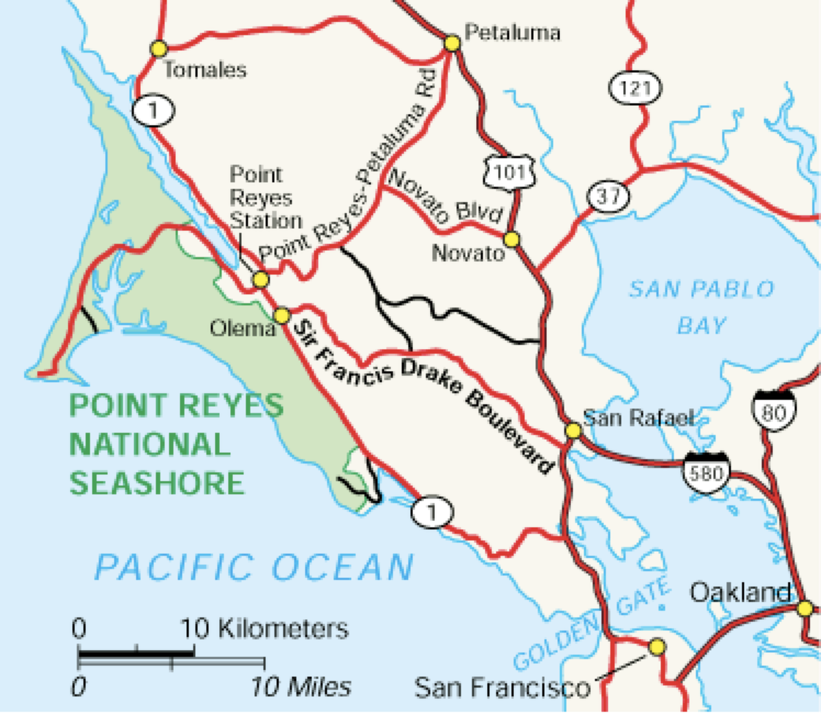

Suprimposing Limits
- Few layers, but many lines
- Up to a few dozen
- But not hundreds
- Superimpose vs. juxtapose: empirical study
- Superimposed for local, multiple for global
- Tasks
- Local: maximum, global: slope, discrimination
- Same screen space for all multiples vs single superimposed

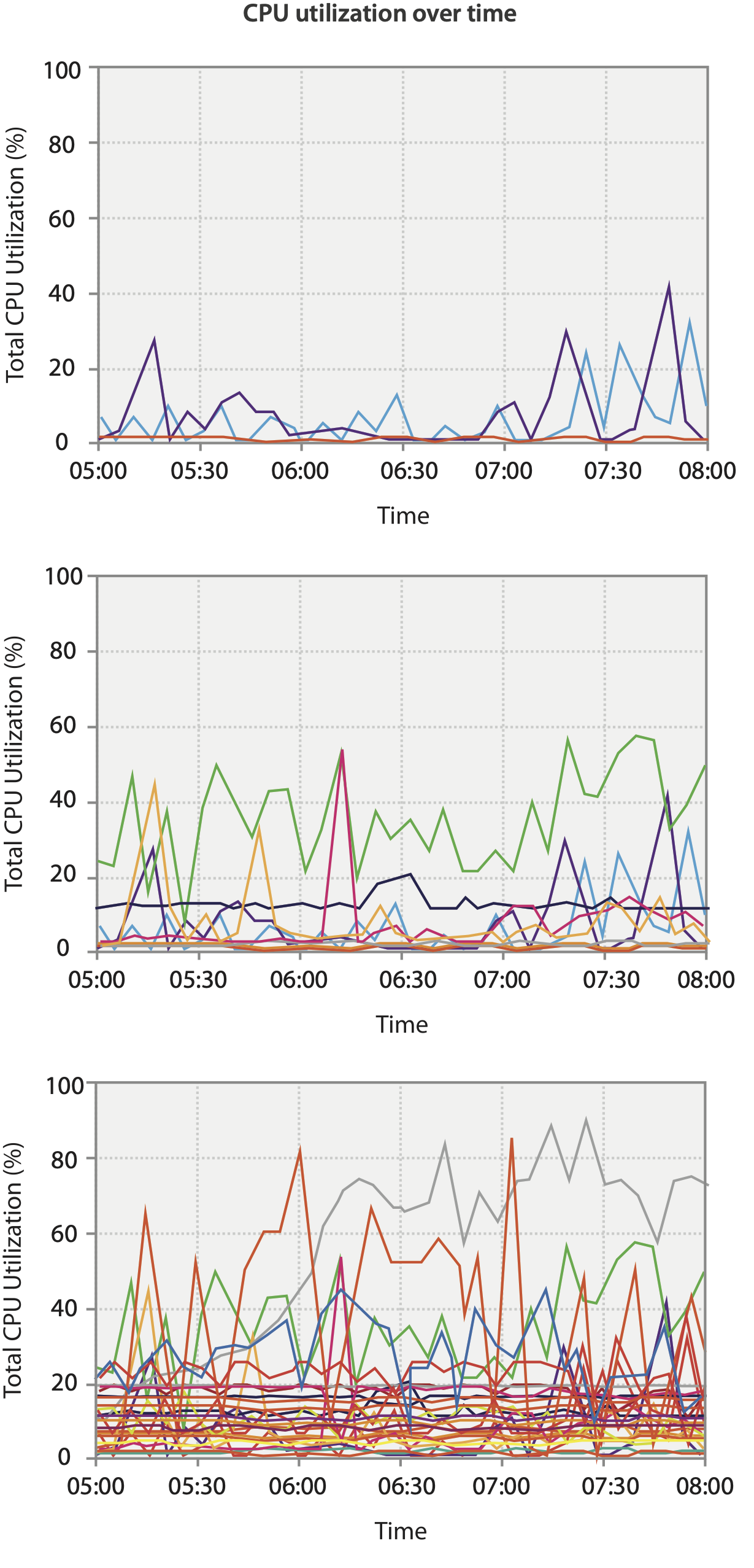
Dynamic Visual Layering
- Interactive based on selection
- One-hop neighbour highlighting demos: click vs. hover (lightweight)
Dynamic Layering
Twitter influencers for #ieeevis2019
Dashboarding in a Box
Tools of the Trade
- Python Dash (from Plotly folks)
- R Shiny
- Metabase?
- Flask + Altair
- Flask + d3
Taking Apart Dash
import dash
import dash_core_components as dcc
import dash_html_components as html
import plotly.express as px
import pandas as pd

external_stylesheets = ['https://codepen.io/chriddyp/pen/bWLwgP.css']

app = dash.Dash(__name__, external_stylesheets=external_stylesheets)

df = pd.read_csv('https://gist.githubusercontent.com/.../gdp-life-exp-2007.csv')

fig = px.scatter(df, x="gdp per capita", y="life expectancy",
                 size="population", color="continent", hover_name="country",
                 log_x=True, size_max=60)

app.layout = html.Div([
    dcc.Graph(
        id='life-exp-vs-gdp',
        figure=fig
    )
])

if __name__ == '__main__':
    app.run_server(debug=True)
Taking Apart Dash (cont.)
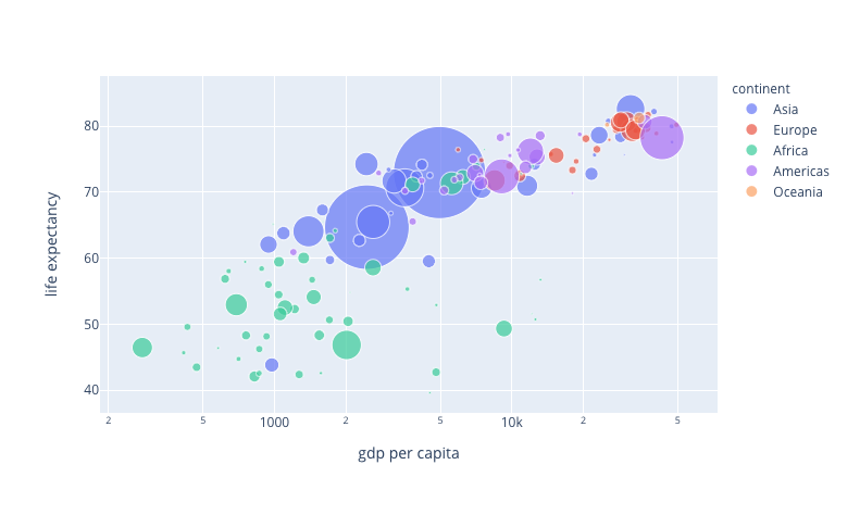
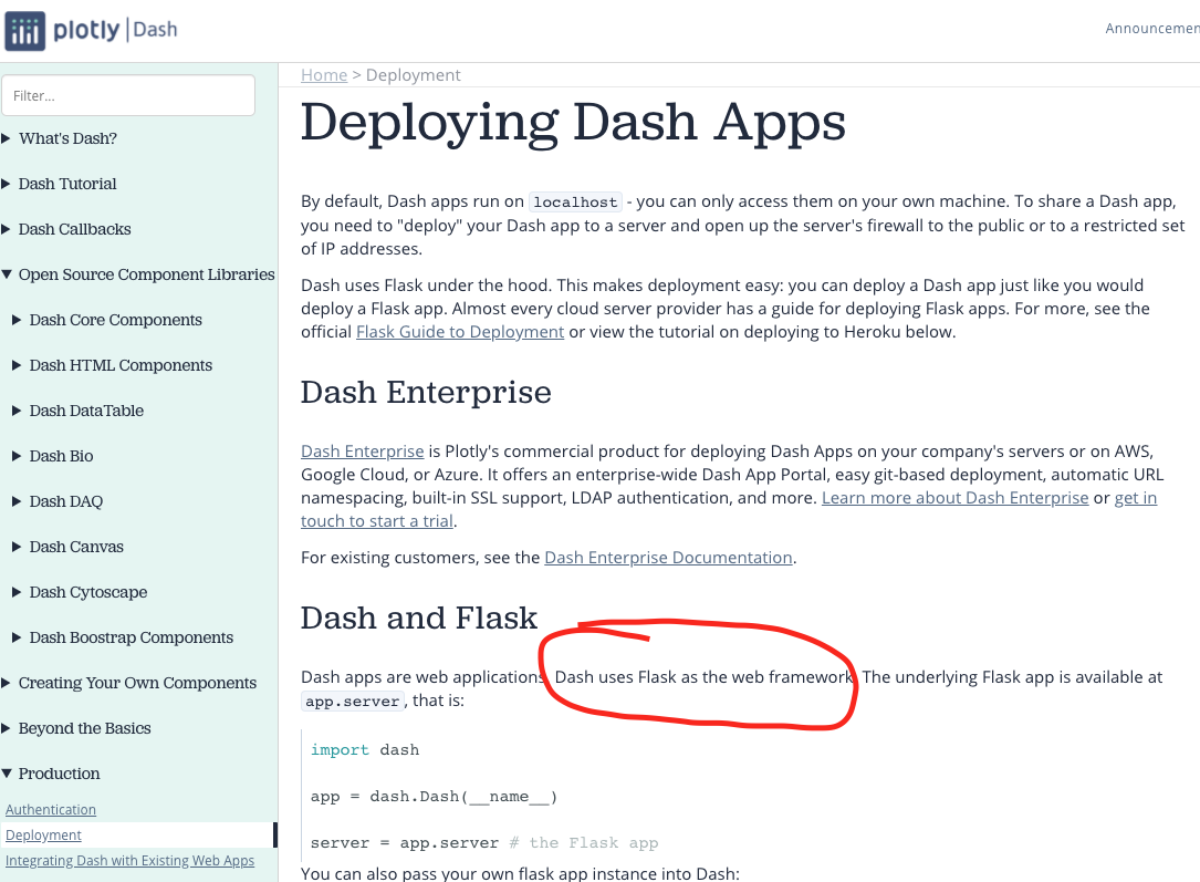
Under the Hood: Tt's Flask
Follow a Request
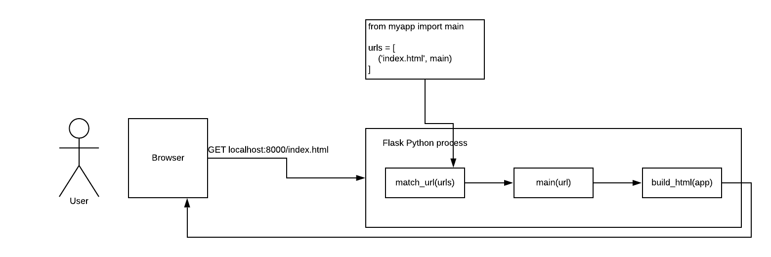
The Code We Used
import dash
import dash_core_components as dcc
import dash_html_components as html
import plotly.express as px
import pandas as pd

external_stylesheets = ['https://codepen.io/chriddyp/pen/bWLwgP.css']

app = dash.Dash(__name__, external_stylesheets=external_stylesheets)

df = pd.read_csv('https://gist.githubusercontent.com/.../gdp-life-exp-2007.csv')

fig = px.scatter(df, x="gdp per capita", y="life expectancy",
                 size="population", color="continent", hover_name="country",
                 log_x=True, size_max=60)

app.layout = html.Div([
    dcc.Graph(
        id='life-exp-vs-gdp',
        figure=fig
    )
])

if __name__ == '__main__':
    app.run_server(debug=True)
So We'll Render a Template Like This
html
head
  {{ for headers in app.headers }}
  {{ header }}
  {{ endfor }}

/head
body
  {{ for div in app.layout }}
  {{ div.render_elements() }}
  {{ endfor }}
/body
/html
Architecture for Visualization
Concepts We Know and Love
- Frontend
- Backend
- What's missing here?
- Processing engine
- CDNs
- Static storage
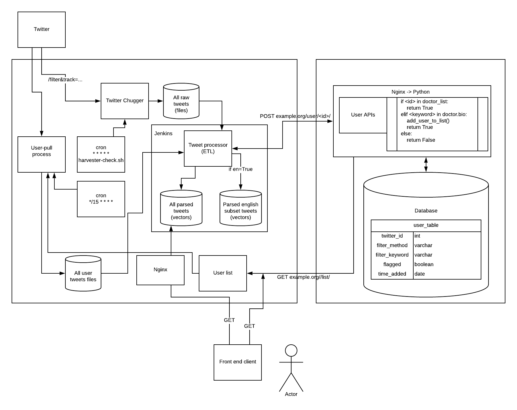
Building Blocks on the Web
- Frontend client:
- JavaScript libraries, run in real time
- Access everything through browser-implemented APIs
- Server:
- Database
- Files (database is a layer over files)
- Web app (running Python/R/Node/etc.)
- Other pieces of a web stack: Apache/Nginx/Gunicorn/UWSGI/etc.
- Non-web-facing processing automation/schedulers (Airflow/Jenkins/cron)
Example: Visualization System Relying on Twitter Data
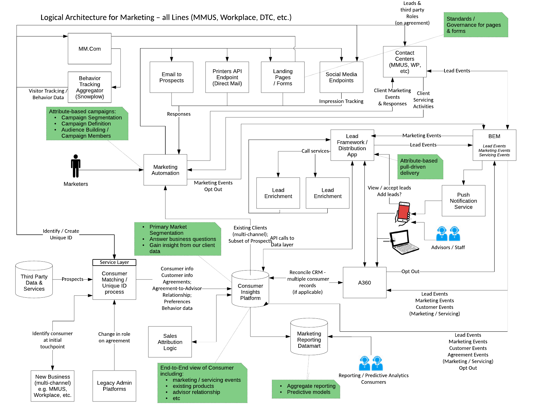
MassMutual's Client Marketing System
MassMutual's Advisor-Facing Mobile App
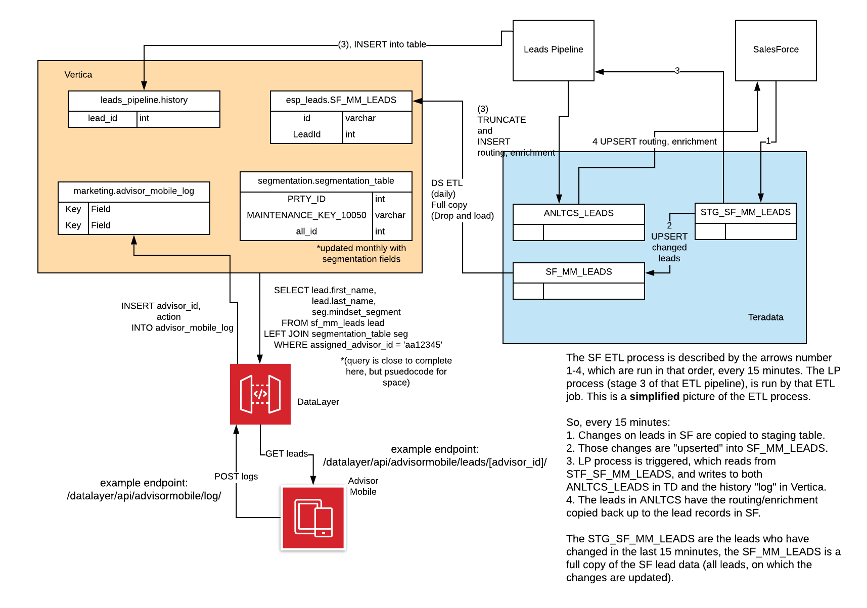
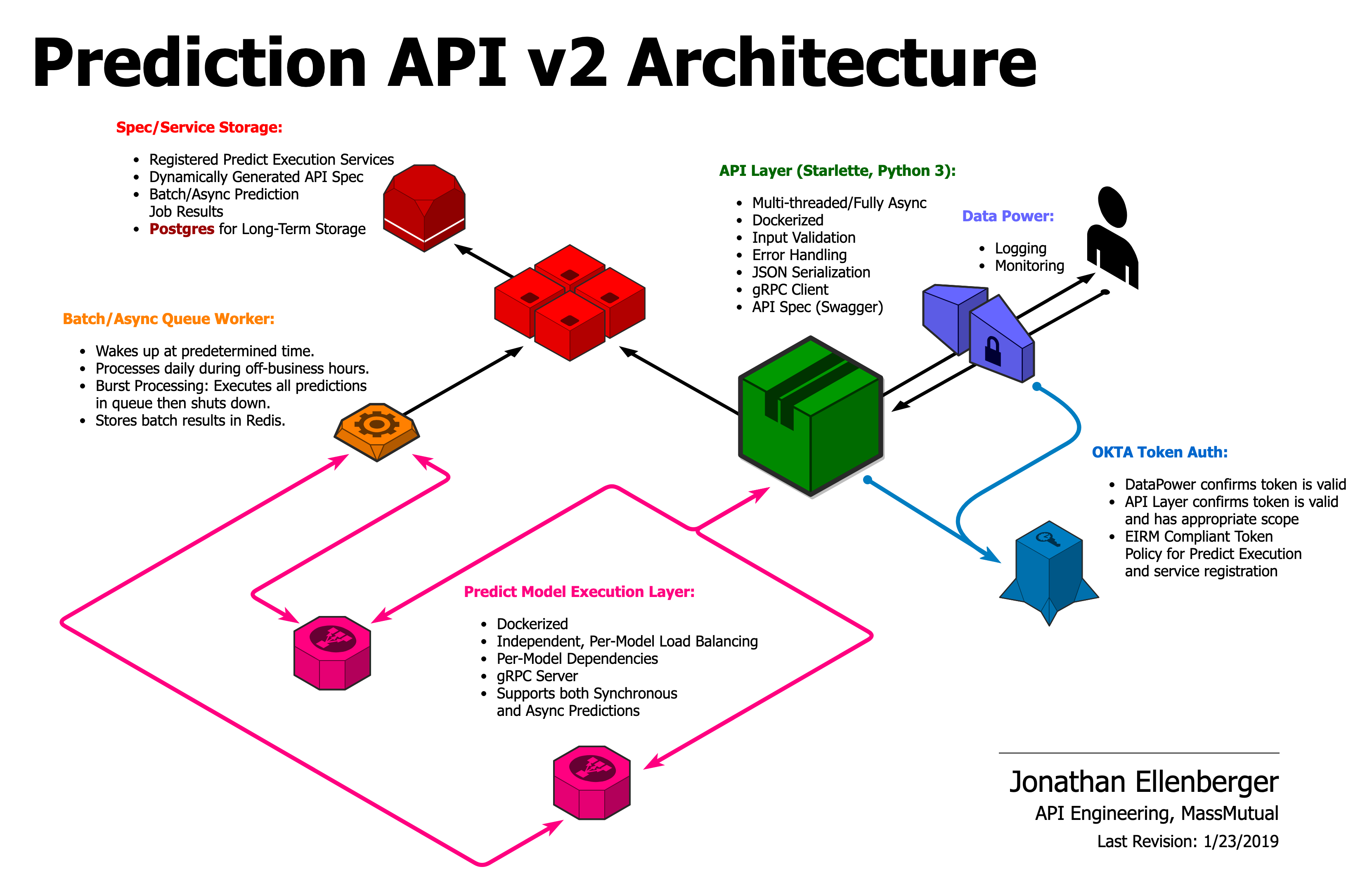
MassMutual's Prediction API

Applying the
Visualization Mantra
Similian

LifeFlow

LifeFlow How-To
LifeFlow Demo
TreeVersity

How to Scroll

What we Learned
- Faceting
- Juxtapose
- Partition
- Superimpose
- Shared data
- Shared encoding
- Shared navigation
- Dashboarding in a box
- Architecture for visualization

